Moses Defending the Daughters of Jethro

Rosso Fiorentino, Moses Defending the Daughters of Jethro, 1523-1524

"Now the priest of a Midian had seven daughters: and they came and drew water, and filled the troughs to water their father's flock. And the shepherds came and drove them away: but Moses stood up and helped them, and watered their flock. And the shepherds came and drove them away: but Moses stood up and helped them, and watered their flock/ And when they came to Reuel their father, he said, How is it that ye are come so soon to day? And they said, An Egyptian delivered us out of the hand of the shepherds, and also drew water enough for us, and watered the flock. And he said unto his daughters, And where is he? Why is it that ye have left the man? Call him, that he may eat bread. And Moses was content to dwell with the man: and he gave Moses a Zipporah his daughter. And she bare him a son, and he called his name Gershom: for he said, I have been a stranger in a strange land." (Exodus 2:16-22)

Fiorentino's painting depicts this scene from Exodus 2:16-22. The scene represented is violent and wild. The shepherds that Moses beats are painted in the nude so that they look like muscled titans. The nudes in the painting all form a circle around Moses, who is the center of attention of this chaotic battle of men. Fiorentino uses highlights and shadows well to show the muscles and strength of all the men in the battle. The agony in their faces can be seen especially with the man on the right, who looks to be shouting and not really doing much else. The girl the viewer sees in the top right is Zipporah, whom Moses would get as a trophy prize for defending them. She is the only figure in the front scene who is clothed in a light blue, which makes her pristine and fragile. But, oops, her dressed slipped a little and we have a wardrobe malfunction. 

Fiorentino used a different technique in his painting. Taking in the new style of mannerism, Florentino had brought mannerism to Fontainebleau in 1530. There he became a founder of French 16th century mannerism, which was called the School of Fontainebleau. Rosso Fiorentino's actual name was Giovanni Battista de Jacopo di Guasparre. But because of his red hair he was nicknamed Rosso which meant "the red one." This painting is an example of Florentino's use of mannerism. The lines and contours of the muscles are stricter lines instead of the Northern Renaissance style of natural looking beauty. 

  • 7:00 AM

The Rescue of Princess Arsinoe


Tintoretto, The Rescue of Princess Arsinoe, 1555-1556

A knight in shining armor with nude damsel wrapped in his arms. Had I been the artist, I would have titled this painting something along those lines. But no, Tintoretto had to go and makes things complicated for me. Thus he called this piece The Rescue of Princess Arsinoe. I will give him credit and say this name reads better, but who is Princess Arsinoe? I have no idea. So Tintoretto has made my job all the more harder.

By this point, any reader would be thinking, “Why doesn’t this kid just Google Princess Arsinoe?” Well I did, and she’s not really an Internet celebrity. The articles on this painting gave no inkling as to who she was. The artsy-fartsy scholars merely spoke of composition and color, ignoring the naked lady in the knight’s arms. I assume they also had no idea, so they began to pompously dance around the topic.

A list of Egyptian royal family members named Arsinoe was the most promising piece of evidence my initial search gave me. Sadly, Tintoretto’s piece doesn’t look like it takes place in Egypt. So I threw that out, but came back to it after I realized no story concerning a medieval Arsinoe existed. Hours and hours (20 minutes) of research followed and allowed me to realize Arsinoe was Cleopatra’s youngest half-sister. Arsinoe opposed Roman rule over Egypt, thus she was promptly imprisoned. Then she was rescued (by unspecified means) and led a rebellion. Eventually, she was captured again and then executed once Cleopatra lost influence in Rome.

I then discovered through the reading of a particularly pompous article that Tintoretto decided to transport the location of the scene from Egypt to Venice just because. The location had thrown me off for so long and to have it not even matter to Tintoretto stung. That’s why I am writing this blog post around 12:30 at night (it is due the next morning). I could have had this thing done days ago if I had known that. But what can you do? Yes, you can cry. You can curse. You could even punch a hole in the wall. In my case, I am doing none of these things. Life happens, and we have to deal with all the unnecessary crap that comes with it. All told, a late night spent with a beautiful painting does not sound too bad. Take these moments, learn from them.

I could have talked about the chains imprisoning the naked ladies, the movement of the boat out to sea and the freedom it represents, the stark vertical divide, or why Romans keep their female prisoners naked, but I didn’t. Instead I wrote you this note. So read it carefully and learn from the moment.


  • 7:00 AM

The Last Supper

Tintoretto, Last Supper, 1592-94 

Out of a selected handful of the famous "Last Supper" paintings, Tintoretto seems to paint the gloomiest one. From the biblical story, the Last Supper, despite the rather despondent outcome of the dinner, usually portrays a scene of hope and optimism, for though Jesus must leave, he leaves behind a world that has changed for the better.

Tintoretto takes that perspective and throws it back in the viewer's face. Perhaps he was bullied as a young child - his last name just begs for mocking - or perhaps he's just a brooding hipster of the late 16th century. Either way, unlike the other famous Last Supper paintings, such as Da Vinci's, Tintoretto portrays this final scene in one of chaos, greed, ignorance, and most of all, pessimism. Not only does he completely revamp the aura of the painting, the characters he includes in it are vastly different as well. In other, classic Last Supper paintings, the twelve apostles sit in reserved and mannered ways, as they carefully keep their eyes trained on the main figure, Jesus Christ. However, in this version, though the viewer's eyes are immediately drawn to the brightest Jesus in the background center, no one else is. All the characters make conversation with each other or stare uncaringly at the ever-so-fascinating mystery item in Christ's hand. There's not a single man or woman that seems to mind that in only minutes later will this holy man be taken away, or the fact that there seem to be wispy, wandering souls just floating in the air. No big deal.

The darkness that envelopes the room is so heavy and powerful that even the burning light and Jesus's own luster cannot seem to dispel it. It's suffocating and pressuring, the obvious symbolism present. Compared to other versions of the scene, the dankness of the room seems to represent sins of every type. Purity does not exist in this painting, besides for Jesus. The indifferent looks on the apostles with one man even bored enough to prop his head up with one hand displays the leaking power of religion.

Tintoretto's rendition therefore brings various criticisms and some unhappy viewers. An outraged cry thrown at him is the fact that the number of apostles at the scene isn't clear. And you can't count. Though undoubtedly a bit more obscure than others, Tintoretto still depicts twelve apostles with the faint glowing halo behind their heads. If one uses both hands and one foot, he or she can easily determine that there are indeed twelve men with faint halos behind them in this painting. Congrats on passing kindergarden math.

Others claim the work lacks realism. Oh really. Does it really lack common sense? Thanks for pointing it out because clearly I missed that while I looked at this. It does miss some realism, perhaps when compared to other paintings of the Mannerism era, but perhaps this was purposeful. Sure these apostles that ignore Jesus have bland and impersonal characteristics, but they're supposed to represent the people, the lower class, or even the society as a whole. But one cannot absolutely label this painting as one that lacks realism for in the foreground the outfit of the servers or even the setting as a whole has a beautiful, realistic and detailed aspect to it.

Despite all the faults people can find, this painting still brings a different perspective to a normally bright and optimistic scene. Though poor hipster Tintoretto still gets bashed, now viewers can undoubtedly appreciate the truthful portrayal of the heart of darkness in each human being.


  • 12:15 AM

Rape of the Sabine Women

Giovanni da Bologna, Rape of the Sabine Women, 1582
This statue began as a technical experiment by Giovanni da Bologna. Ancient records claimed that the Romans had created statues from single blocks of stone, which was found to be untrue by Renaissance historians. da Bologna set out to achieve what the Romans could not by creating a complex group of figures from a single block of stone, in a composition which originally had no name or mythical inspiration. When Francesco I de'Medici decreed that the statue be put on public display, da Bologna named it the Rape of the Sabine Women, after a legend about the founders of Rome abducting the unmarried women of a neighboring tribe to swell their numbers. (In this context, "rape" is a direct translation of the Latin "raptio," which means something more like "abduction," especially of several women at a time.)

The three figures, two men and a woman, are closely packed together and elongated after the Mannerist fashion. Bologna's masterful creation of a "figura serpentinata," a spiraling style of composition popular at the time, curls upward in a tight spiral, culminating in the woman's outstretched hand. No one principal viewpoint exists for the observer; the statue may be viewed from multiple angles. The various emotions of the group and the dynamic posing gives the statue an uplifting motion and an undeniable sense of movement. As a demonstration of technical skill it is truly impressive and undoubtedly da Bologna's masterpiece, especially when compared with the serene, static figures of seventy or eighty years before. However, his self-imposed limit provided by the single block of marble leaves the statue feeling tense and cramped.


  • 7:00 AM

Venus of Urbino

Titian, Venus of Urbino, 1538

For a quick moment, try not to look at the evident sexuality here. Titian clearly created this as a tribute to his friend/master Giorgione, who created a strikingly similar Sleeping Venus in 1510. The piece was commissioned by the Duke of Urbino Guidobaldo II Della Rovere to serve as a teaching model for his young wife. The Duke, concerned that his new wife would be unaware of her "marital obligations," wanted Titian to create a woman exemplary of what he was looking for from his bride.

The piece itself has become rather infamous, probably because of how... out there Venus is. Her gaze aims directly at the viewer, her entire demeanor upsetting the almost voyeuristic feel of the scene portrayed, with the curtain behind the model, possibly a posing courtesan, on a bed. Simply studying her posture is even implicating, with her unabashed swagger and immodest pose. If you've got it...

Titian also sneaks in quite a few symbols of wifely duties other than the whole naked thing. The dog on the bed with her is a symbol of marital loyalty and companionship, while the maidservant rifling through the dresser in the background is somehow a symbol of motherhood. Makes you think twice about looking through your drawers too hastily, doesn't it?

Mark Twain did not enjoy this piece at all. He actually ranted about it, saying, 
"without obstructing rag or leaf, you may look your fill upon the foulest, the vilest, the obscenest picture the world possesses - Titian's Venus. It isn't that she is naked and stretched out on a bed - no, it is the attitude of one of her arms and hand... but there the Venus lies, for anybody to gloat over that wants to... I saw young men gaze long and absorbedly at her; I saw aged, infirm men hang upon her charms with a pathetic interest. How I should like to describe her - just to see what a holy indignation I could stir up in the world - just to hear the unreflecting average man deliver himself about my grossness and coarseness, and all that. The world says that no worded description of a moving spectacle is a hundredth part as moving as the same spectacle seen with one's own eyes--yet the world is willing to let its son and its daughter and itself look at Titian's beast..."
Though possibly overreacting, Twain brings up some brilliant parts of the piece, which were purposefully put there. It is obscene, she definitely has attitude, and it isn't obstructed by anything...but all of that was Titian's goal. It was meant for a private setting, to be displayed in the Duke and Duchess' bedroom, and it serves that purpose well. It's not like it was going to be over the dinner table.


  • 7:00 AM

Bacchus and Ariadne

Titan, Bacchus and Ariadne, 1520
You know what really sucks? Having to leave your family to follow your heart and your boyfriend. You know what is even worse? Having to help him escape a minotaur and risking your life to do so. Want to know the really,really bad part? Having him abandon you on the island, Naxos. Yeah, sucks to by Ariadne. But, as usual love finds a way into her life once again in the form of the god of merriment and drinking, Bacchus.

Titian painted Bacchus and Ariadne in 1520 for the Duke Alfonso’s private dining room. Titian was not the only artist to do a piece of art work for the Duke, he also commissioned artists like Bellini to add to his collection of art inspired by classical mythology. There is something rich and rewarding when feasting your eyes on this Titian. The movement that Titian gives the painting truly helps encompass the viewer in the scene. As the entourage following Bacchus push toward Ariadne, she pushes outward helping add to a circular flow in the painting. She reaches out to the sea for her “love” who has abandoned her without any means of getting off the island. She locks eyes with Bacchus who is in mid-leap to embrace the woman he has become infatuated with. The scene takes on a joyous feel as the cheetahs, satyrs, and other uncommon friends join in the merriment of the moment. The colors bring the tantalizing feeling of new love to life. The blue hues in the sky and Ariadne's dress are a breath of fresh air to the mellow, darker colors on the right of the painting.

Above in the night sky is a starry crown in which Bacchus transfixed in the sky after Ariadne’s death. When they were married, he gave her a golden crown, and he wanted the world to forever remember the love they shared. Now if that’s not love, I don’t know what is. That bad day just got better.

  • 7:00 AM

Hunters in the Snow

Pieter Bruegel the Elder, Hunters in the Snow, 1565

A day and a half come and past. A night spent among the towering skeletons of trees. A night spent in the silent vacuum of winter. A scrawny fox carcass - more fur than food - is all the men have to show for their trouble. 

Not one of the three has spoken since the group turned back. Even the dogs, they notice, don't dare to wimper. The winter has been long. Cold. Deep. Deeper than the snow drifts that now swallow their boots to the brim. The elemental intrusion means little. Their feet are long forgotten. The rise and fall of the earth is all they know. 

Finally they fall no more. The next rise is the last. The sounds of the village drift over the crest of the hill. They forfeit footing for their final flight to the top. Lungs aflame and muscles screaming, the men lift their weary eyes and take in the majesty before them. The valley greets them as it always has. The village below them slips away, voices fade, and for a moment nothing exists. Nothing but the unfeeling spires of the great mountains that line the tiny village. No depth. Only death. 

A raven slices through the frigid air, and lets forth its shrill caw. A sudden gust of wind breaks the still of day. It falters momentarily before diving into the valley.

The man carrying the fox watches as the bird makes its way through the village, winding in and out of buildings, until finally disappearing into the trees. He glances to his left as the aroma of fresh firewood reaches him. A woman scolds her children as they prepare a fire for the feast. To hear her tell it they don't have a brain in their head, nor muscle in their bodies. Slowly a smile makes its way across his face. Her words hide love. 

The feast. It was intended to be the game his party had caught. However, that amounted to the single fox that now swung to and fro from his back with each step he took. The village had expected more than this. He had as well. No matter. They would put something together. Neighbors would provide for one another. More a feast than ever. A communion. 

He makes his way down the slope and through the village past the frozen lakes where friends and family spin and twirl. Again, a smile. Maybe he would skate tomorrow. His first time this year. But first he must go home. Waving, nodding, calling out, he makes his way through the town, past the church, and onto the wooded road to his home by the stream. Through the trees he sees his son playing on the ice. The boys laughter floats gently to his ears. A gentle plume of smoke rises from the chimney. Warmth washes over him. 

High above the birds have retaken the sky, but the ravens will not rest here tonight.


  • 7:00 AM

The Beggars

Pieter Bruegel the Elder, The Beggars, 1568
I am disturbed by this painting. The pain bleeds raw emotion through Bruegel's strokes. These men are at the absolute, ultimate bottom. Emotional, physical, and societal turmoil bombards them on all fronts. Degraded even further, the five parade around in a circuitous spectacle. They are ignored by the passerby, who keeps his head down, staring at the object in his hands. Ignored and ridiculed, disfigured and degraded, they represent the lowest a human can sink.

A closer look at the headwear of these figures reveals a layer of Bruegel's token social critique. The leftmost beggar wears a paper crown, and following to the right: a paper shako as worn by the soldiers of the day, a beret to represent the bourgeois, a simple cap typical of a peasant, and a bishop's mitre. Bruegel uses this attire, placed upon such lowly individuals, to comment of the equality of man and the futility of class structure. Beneath any social standing hides a the soul of a human, however hideous that might be.

  • 7:00 AM

Bird Trap

Peter Bruegel II, Bird Trap,1565
When you first look at Peter Bruegel you don't seen elegance or an array of golden charms but rather a gorgeous simplicity. Bird Trap, painted in Antwerp shows the simplicity and beauty in the peasant life. The title pertains to the makeshift wooden plank, un-manned almost forgotten thrust to the right side. Why does Bruegel choose to depict peasants? Is it for their importance to their respective posts? Or is it simply a mockery? The painting highlights the harsh truth that these peasants are a bunch of drunkards who would rather ice skate than do real work.

Cold, one word to describe the bleak white capped buildings and barren trees,.  cold is all around. Green blue mixed in with gray a palletethat Bruegel uses to produce a hues that subdue the warmth in the piece. Despite the chilly climate there is a warmth characterized by a way of life only known to those with little to nothing. Community to summarize it in one word, everyone working together to make it through the harsh winter, to overcome hardship together. The ice skaters blissfully breeze through the harshness of the climate surrounded by family and friends that make the viewer crave companionship.

The beauty in Bird Trap is derived from the simplicity of life; Luther's reform brought about new aspects in which to view ideology and theory. A drastic change to the spirituality of the north frightened many and begged the question of how ones life would change. Amongst those in jeopardy of loosing their lifestyle, the peasants. Bruegel painted this scene to show the way of life that continues to function, a tribute to the past. A futile attempt to preserve the ever changing social strata that now surrounds the north, no one left to trap the birds, no one left to live the simple life.


  • 7:00 AM

The Harvesters

Pieter Bruegel the Elder, The Harvesters, 1565

This is why I love Art History. Bruegel’s work in general captures the magic of the present through his subject matter. This painting is one of six paintings in a series where Bruegel captures the peasantry in Antwerp through several different seasons and weather conditions.

Now I could speak about the painting formally, but do I have to? Just looking at the painting you can see the balance and the use of colors. You witness its beauty.

In The Harvesters, Bruegel has depicted exactly that - peasants tending to the fields, the cogs of this town in motion. And within this heaven, this little niche under a tree, the viewer finds a sense of home. Bruegel accurately paints the feeling of being a part of a community. This idea is what I take away from the painting. Bruegel has created this scene where people are hard at work, doing their daily chores and duty. That is their life on a day-to-day basis. The church, obscured in the background, sits in the back of everyone’s mind, yet it is not their main concern. They’re too focused on the work ahead of them, which is entire left side of the painting of wheat yet to be harvested.

They beauty is the commonality Bruegel has captured within these people. Taking the Northern Renaissance a step even further away from the in your face religious depictions in the south. Through the composition of the flora in the right side of the painting, Bruegel takes the emphasis off of religion and pulls back the curtain to reveal the landscape, a town, and its people. I get a feeling similar to Bruegel’s Hunters in the Snow, where although they are all performing a laborious act, it is for the greater good, all these people coming together to improve their quality of life in unity. You feel the warmth.


  • 7:00 AM

Christ Carrying the Cross

Pieter Bruegel the Elder, Christ Carrying the Cross, 1564
Forget the title of this painting, and look at it with fresh eyes. Bruegel scatters a crowd across an awe-inspiring landscape of lush greens and browns, giving nature center stage and contrasting the immensity of the environment against the relative littleness of humanity. This re-prioritization, this turning the tables, gives away Bruegel's piece as classic Northern Renaissance.

Despite Bruegel's emphasis on the natural world, he puts an immense amount of detail into his people. Note the red-clad soldiers dabbling about various parts of the landscape. Bruegel painted these fellows' uniforms to resemble those of the Spanish invading forces who occupied Flemish territory during Bruegel's lifetime. On a larger scale, the reds serve as a colorful connect-the-dots, leading one's eye across the painting to the main event (main according to the people, of course), Golgotha. Golgotha, a.k.a. Calvary, marks the location of Christ's crucifixion. Translated, it means "place of the skull," and Bruegel inserts a large animal's cranium into the bottom right corner of the painting to acknowledge this.

Now let me draw your attention to the frontman of this piece, the ubiquitous Jesus Christ, messiah, son of God, and, in this case, spectacle. Bruegel's painting doesn't put the spotlight on Jesus. He hides him, better than most Where's Waldo puzzles, amongst the masses. Although in the center, Jesus doesn't appear larger than his fellow humans - in fact, he crouches beneath the cross he struggles to carry. The humanization - almost degradation - of Jesus offers a perspective more accurate to the time of his crucifixion. On the road to his execution, Jesus wouldn't have been glorified or put on any sort of pedestal, he'd be humiliated and ridiculed and spat on.

Bruegel's masterpiece manages to send a trifold message - one to emphasize the glory of nature, one to make a socio-political statement about the Spaniards, and another to portray the iconic road to Calvary scene in a fresh light.

  • 7:00 AM

The Ambassadors

The Ambassadors, Hans Holbein The Younger, 1533

Like many struggling artists Hans Holbein The Younger was trying to get a name out there for himself. None of his paintings had given him the success he wanted. He had to do something great, something different. He went with an anamorphic painting. It worked. Holbein's painting The Ambassadors created much talk about him. Holbein would finally get the recognition he wanted, and it was the  the only painting that Holbein signed and dated. 

Some say that the only reason Holbein painted this painting was to show off and obtain recognition. Maybe that's true; however, when studying the painting there is so much more to it. The two men in the painting are most appropriately ambassadors. The man on the left is Jean de Dinteville, aged 29, who is the ambassador of France to England. He wears fine silks and a fur coat, all decorative and super expensive to show his wealth. He wears the order of Saint Michael around his neck, but on his hat the badge is decorated with a skull. He stands with a wide stance to symbolize his power. He also has an extremely cool beard. His friend on the right, Georges de Selve, is a bishop, but on occasion he was the ambassador of the Venetian Republic and to the Emperor. He is dressed more modestly, however his coat would still be rather pricey. His beard is not as cool. 

The shelves in the painting contain many objects of importance. There are two globes in the painting. One globe on the top shelf is celestial and the globe on the bottom shelf is terrestrial. There are suggestions that say the painting is intended to have three levels to it. The top shelf meant to symbolize the heavens due to the instruments used to understand the heavens and measuring time. The second shelf represents life, which contains music and a religious text. The third is the floor which is death represented by the skull. The lute on the second shelf has a broken string and placed next to a lutheran hymn book which signifies the strife between the church and scholars. The instruments on the top shelf have all been frozen to 10:30 a.m. on April 11th to show that time is frozen and the future may hold something very different. Another suggestion holds that the painting was intended to be hung above a staircase so that when viewers would climb the stairs the would be frightened by the skull they did not see before. This was supposed to be a reminder that death is upon us all and we cannot avoid its calling.

End note: The floor of this painting is extremely similar to the floor in Westminster Abbey:


  • 7:00 AM

Mad Meg

Pieter Bruegel the Elder, Mad Meg, 1562
Originally known as Dulle Griet/Dull Gret (which is also a medieval "super-gun" from Belgium), Mad Meg is a unique character of Finnish folklore. Gret is also a derogatory name given to any ill-tempered, shrewish woman - use it wisely. So the story goes, this demon-kickin' lady raided Hell itself and looted its riches along the way. Totally apocalyptic at first, but it has so many comic overtones when you try to wrap your head around the story and scenes within the piece. Upon initially viewing it, Mad Meg looks completely over-sized compared to the characters she shares the piece with, but Bruegel's pieces are usually viewed from above, which gives the feeling that she had already raided Hell and was escaping the uproar she left below. The thing I love here is that, especially for the time period, Meg has such power and she's clad in male armor...and with a weapon, no less. Underneath her armor is the usual haus-frau garb, but her different layers, both metaphorically and literally, give her such depth.

Light plays a great role in this piece, sweeping the gaze from the light source up in the right corner to the mouth of hell. The colors in the piece scream chaos and confusion, with each individual scene almost blending in with the others in one big, hellish mess. Bruegel portrays other strong women here, Meg's followers, in the scene directly to the right of Meg, fighting off demons themselves. His characters here are Bosch-esque, showing such perversions of God's creations much like in Hell, leaving me curious if he had a bit too much of the insane root. The castle wall metamorphosed into a face with a mouth gaping open as the entrance to hell is a prime example. Also indicative of Bosch are the deviations of religious symbols in the piece, like the eggs, which usually signify fertility but are all rotten now.

While the story of Mad Meg is worthy of a page in itself, the thing I loved about the background of this painting is the Dutch Revolt, or Eighty Years' War, going on during this period. The Dutch Protestants craved freedom of religion, but Charles V and, later, Philip II wanted only to defeat Protestantism. Bruegel's piece here includes some scenes of scathing political criticism, like the faceless soldiers venturing into hell itself and engaged in meaningless struggle (with a fish man... insane root, I'm telling you). To skip a history lecture I don't want to write, the revolt ended with the creation of the Dutch Republic - the first republic ever, but also the first one with the separation of church and state. Bruegel comments on the political state around him just as much as he illustrates a crazy Finnish folkloric tale in one big chaotic mess that somehow says so much in its crazy contents.


  • 7:00 AM

Great Piece of Turf

Albrecht Durer, Great Piece of Turf, 1503
In 1503, after his first visit to Italy, the 32-year-old German artist Albrecht Durer painted  a series of natural objects in a realistic manner. Among them, the Great Piece of Turoutstandingly demonstrates his ability to capture nature in an extremely realistic and detailed way and shows he possesses the discipline to get it right.

The painting precisely depicts several vegetations under a naturally disarrayed circumstance, including dandelion, daisy and yarrow. In comparison to contemporary mainstream religious paintings, this piece of turf produces a air of secular freshness. However, under the impression of Luther's religious Reformation - where peasants challenged Church's authority and papacy, and individuals were believed to have direct relations with God - people tend to argue that Durer deliberately presented the piece of turf as representative of ordinary people, thus he embraced the idea of religious reformation. 

However, I see it differently. Speaking of sixteenth century northern European peasants, I think of Bruegel's paintings, particularly, his Peasant's Dance. Under Bruegel's brush, sixteenth-century peasants give me an impression of enthusiasm, boorishness, passion, and a sense of rough, untamed power. However, looking back on Durer's turf, I see simplicity, rational sense, close observation of nature, and a calm and undisturbed attitude towards life. Nevertheless, it is difficult to tell whether the underlying theme is religious or secular. However, by simply imagining the process of creating such a painting, it is not hard to see Durer's intellectual pursuit of perfect depiction and an appreciation of the nature. 

Durer once said, "True art is firmly fixed in nature. He who can extract her thence, he alone has her." Putting aside the ideological argument, the fact that Durer brought out such a freshness in a world of biblical artworks makes me - and surely his fellow artists - smile.


  • 7:00 AM

Isenheim Altarpiece: Temptation of St. Anthony and Paul and Anthony


Matthias Grunewald, Isenheim Altarpiece: Temptation of St. Anthony and Paul and Anthony, 1512-15
I am in a quandary, faithful reader. Matthias Grunewald’s Temptation of St. Anthony poses a frightening question I cannot face alone. Which of the demon’s beating St. Anthony frightens you the most? For myself, I have narrowed it down to two formidable contenders. In one corner of the ring, we have Demonic Bird with a Stick (see bottom left hand corner of Temptation). At first, this odd caricature made me laugh solely because of how ridiculous the thing looks. It reminds me of a chemically-altered chick whose feet are way too long… but then I noticed his stick. If one gets out their protractor and traces the stick’s trajectory they will be horrified when they reach Demonic Bird’s targets. Guys in the room please do not flinch as I dub the stick the unholy castrator. St. Anthony, be warned this Bird plays dirty. 

Detail: The Lovecraftian Armadillo 
In the second corner of the ring, I introduce the Lovecraftian Armadillo (see bottom middle of Temptation). This brutal beast may be small, but my God it’s hideous. I call it Lovecraftian because it reminds me of something that would crawl out of H.P. Lovecraft’s nightmares in order to feed its insatiable hunger for children. The Armadillo’s beak also gives him the ability to tear off St. Anthony’s fingers in order to get at the prayer beads. The beast appears to be ripping the faith from the Saint’s hands. 

You have your contenders: Demonic Bird with a Stick vs. Lovecraftian Armadillo. Who will win in this fight of the century? But let the spectators take a good look at the arena before they decide.
Temptation is not a standalone piece. Paul and Anthony coexists alongside Temptation, which makes sense since the two paintings’ staging mimic each other. Notice the curve flowing down the demon’s arm and into Anthony’s head. This curve can also be found along the tree, down through Anthony and between the two saints in Paul and Anthony. This staging brings the focus onto Anthony (and Paul) in both paintings, though Grunewald uses his eerily similar staging in two very different ways. In Temptation, the curve and the downward force of the demons stomping on Anthony traps the saint. Paul and Anthony seems more free, while also being enclosed by the two rocks in the background. These rocks bending towards each other symbolize the two saints meeting, making them equivalent to two forces of nature. Also, the space behind the curve and immediately in front of the curve is hollow. Nothing traps the two saints in the painting. They possess this enclosed, sacred place where they can freely worship God.

But all this analytical, theological, and art historian jibber jabber talk bores me. What we all really want to know is who would in a fight, Demon Bird with a Stick or Lovecraftian Armadillo? After much thought on the subject, I cast my vote with the Lovecraftian Armadillo solely because the Demon Bird’s stick has no chance of breaking the Armadillo’s shell.


  • 7:00 AM

Peasant's Wedding


Pieter Bruegel, Peasant's Wedding, 1568
Pieter Bruegel did not imbue his painting with much meaning. I like that. At this wedding, what he shows us stands alone, with no symbolic meaning hiding behind the pigment. Bruegel depicts here one of his favorite scenes. He often visited peasant weddings. His painting shows the bride in front of a blue tapestry with a serene, satisfied look on her face. A dark red crown rests on her head. However, the groom’s identity remains mysterious. He hides somewhere in the painting. Some guess he is the equine man gregariously calling for more wine in the foreground. Actually, I haven’t seen anyone guess anything other than that. But no one really knows. Everyone seems to enjoy the feast. Two musicians serenade the crowd with bagpipes, and one man in back seems to enjoy a large jug of wine a little too much. A priest and a lord, identified by their garb, sit apart from the peasants on the right side. They seem lost in their own world, separate from the revelers.

Compositionally, the piece radiates warmth. Dark reds and yellows spread throughout. Their feast feels sheltered. The outside world cannot intrude. As such, all of the extremely odd-looking people—they really do look strange—have contented smiles on their faces. Bruegel emphasized the hard work of the peasants. This feast represented their opportunity to take a break from the difficult life they usually lead.

This piece truly has almost no meaning behind it. I did find one cool thing. Apparently the spoon in the hat of the man carrying the pies shows that he is poor, because he never knows where he will have supper that night. He comes prepared. Other than that, Bruegel’s painting has no deeper meaning. I think that in this case, that fits the piece. Bruegel sought to depict the simplistic lives of peasants; these people worked to survive. They had no time to search for deeper meaning or reflect on the classics. Moments like this were their only solace.


  • 7:00 AM

Orpheus and Eurydice

Jean Raoux, Orpheus and Eurydice, 1709
Orpheus bravely prances down into the Underworld, playing his enchanted violin for the Queen of Hades, Proserpina, and winning the freedom of his beloved Eurydice. But there is a one stipulation: Orpheus cannot look at Eurydice until they reach the upper world, or else Eurydice will disappear back into the Underworld. Upon his first sighting of earthly light, Orpheus looks to his lady only to find that she has not yet crossed the threshold to the upper world and she vanishes. Good thing he dies later and his soul goes to the Underworld, and he's reunited with his woman? I can't tell what emotion that's supposed to make me feel. 

The way Raoux paints the gleeful part of the story, after Eurydice is released and they blow that overly-heated Popsicle stand like newlyweds, is almost theatrical in its rendition. The lighting on the happy couple resembles stage light, darkening the rest of the scene in contrast, and the positioning of the other characters draws a tight circle around the two. This circle is open-ended, with Orpheus's violin-laden hand gesturing for the two to get out of there and pushing the scene to the right. The painting seems especially compressed because it was cut down on all sides in the early twentieth century, leaving an almost claustrophobic scene in its wake...if not for the joyful scene inside.

Hades lurks in the back next to his woman, both of them looking a little smug. The Three Fates, clique-ish but beautiful, foreshadow Orpheus's future unhappiness because of his overzealous eyes. Perhaps the OCD part of me is overreacting, but I was completely grossed out to see that bald man reaching for the nicely- arranged fruit on the ground of the Underworld. Of all places to leave food, that is up there as one of the worst possible places. I know they symbolize giving wealth back to humanity, "the fruits of their labor," but it's unsanitary.

Something to leave  you with: Virgil's story is the kindest telling of Orpheus and Eurydice's tragedy by far. In Plato's Symposium, the bitter gods only give Orpheus an apparition of Eurydice, and he never actually gets to see her. Plato represents him as a coward, too scared to die for his love and begging the gods to allow him to come down to the Underworld alive, and he is punished for his cowardice by eventually being killed by women.

  • 7:00 AM

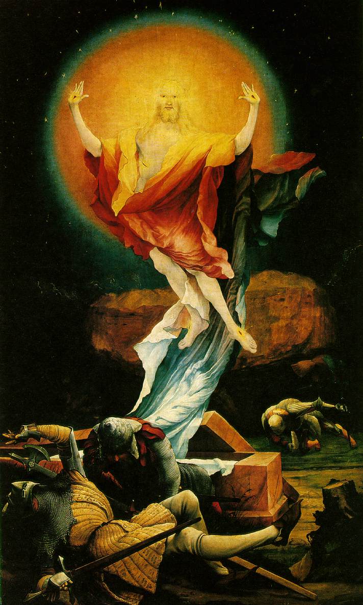
Resurrection

Grunewald, Resurrection, 1512-1516
There exists somewhere in the galaxy a giant spaceship watching the daily life of the human race. At the helm is Ashtar Command, a benevolent conscience that has decided to take the fate of the human race under its wing. A chosen few are allowed to ascend to such a spaceship to experience life, not as a mortal body, but as an elevated conscience. These individuals return to Earth as Light Workers, chosen to spread the message of Ashtar and encourage others to ascend to the fourth dimension. All of humanity must learn to ascend, or else, in a time of need, only few will be able to escape danger while the non-believers are left behind. 

Grunewald paints Jesus like he's a Light Worker ascending to the Ashtar Command. The cosmic energy vibrates around him, ready to take him to the fourth dimension to join the rest at the helm. The non-believers slumber at his feet, unable to wake up to their cosmic openness. 


  • 7:00 AM

Wedding Portrait


Jan Van Eyck, Wedding Portrait, 1434

Distinctly Northern Renaissance, Jan Van Eyck's Wedding Portrait, or sometimes referred to as Arnolfini Portrait, is well known its enormous amount of symbolism. Though Wedding Portrait is still far from reaching the intensity of some of Brueghel's paintings, there's apparently more symbols than one can count with two hands. 


However, my dirt with this painting, or perhaps the entire Wedding Portrait fandom is their interpretation of the objects inside the painting. (I sometimes have this issue with book symbolism, too.)


For example, let's start with the discarded shoes on the bottom left. According to the high and mighty artsy people, those pair of shoes drawn in the corner mean sanctity. Perhaps they were standing on holy ground. They were getting married. But what if the man tossed those shoes to the side because they're uncomfortable, not to mention unsightly? I mean, look at the acute angle shape of the slipper. It wouldn't be comfortable even if the shoe were made of downy feathers.

What about the dog in the bottom foreground? It can be understood as a symbol of fidelity and perhaps wealth (due to the rare breed of the dog). But I wonder, what if, the dog was just a beloved pet the couple wanted in the photo with them?

There’s also the hanging chandelier. Clearly, the chandelier wasn’t meant for light when the sun falls behind the mountains and darkness creeps up. It’s a symbol for the unity of a marriage because that’s what all chandeliers are created for.


But perhaps the interpretation that most irks me is that faded, slightly hidden orange on the windowsill in the back. Does it really represent the purity and innocence before Adam and Eve, or is it really just an orange the couple forgot to hide in a pantry because the painter came in too soon? I would rather prefer the latter. It’s an orange, and nothing but an orange. The Bible doesn’t even specify what fruit Eve picked in the first place, so naming that isolated orange in the background as a symbol of innocence before the fall of Adam and Eve stretches the interpretation by a few miles. 


But despite the (in my opinion) wacky interpretations of the painting, I don't doubt the skill and cleverness behind the paintbrush. Van Eyck's oil painting is almost the epitome of a Northern Renaissance painting, with attention to detail, humanism, and lack of ornate decor. You see, a shoe can sometimes just be a shoe. 
  • 7:00 AM

The Crucifixion

Matthias Grünewald, The Crucifixion, 1511-16
The disease is called “St. Anthony’s Fire,” or more commonly known now as ergotism - a fungus one gets from ingesting rye bread causes the gruesome flesh wounds, seizures, and many other painful symptoms. That’s what’s happening to Jesus skin at the moment, it was not usually so green and well gross. The Isenheim Altarpiece, painted by Matthias Grünewald, was going to a monastery in Alsace, France that treated the horrific disease. Apparently if Jesus had it in the painting, it would be more bearable for the patients who were suffering and forced to look at it. Medieval thinking, what can you do?

The painting is not supposed to express Grünewald’s ideas as a painter or thoughts on life, rather teach the illiterate poor about their God and his sacrifice. The painting as a whole screams death, dying, betrayal, and sacrifice. The cross looks thrown together at the last minute, and the beams look raw and crude. Christ dies in the barren dessert with a ghoulish yellow light in the distance. The off-putting Christ is not intended to connect to the everyday viewer, but instead the patients in the monastery. A porcelain-skinned savior does no good to them while their bodies are deteriorating and dying from the outside in. Christ mirrors their pain in his own suffering on the cross, allowing them to be a step closer to God.

Little is actually known about Matthias Grünewald, only one of his contemporaries, Albert Durer actually rose to modern day fame. However, the altarpiece gives us an introspective look into his life and emotional state. The painting feels as though Grünewald has put his soul into it. He has workedto allow the viewer to not only look, but also to feel. If the viewer doesn’t react to the dying Christ reaching out for a help that never comes, well,  they aren’t looking close enough. One cannot walk away from the painting feeling a sense of happiness for the redemption that awaits them, because how can one feel redeemed when they have caused this man so much anguish? Clearly one man, Paul Hindemith, was touched so much so that he wrote an opera about Matthias Grünewald called Mathis der Maler. Clearly Hindemith is singing Grünewald’s praises, as am I.

  • 7:00 AM

Peasant's Dance

 Bruegel, Peasant's Dance,1538
Bruegel’s Peasant’s Dance makes a statement about the unholy practices and pursuits of the lower class. At least two of the seven deadly sins are portrayed in the painting. The lustful couple on the left of the composition, as well as the vain man with a peacock feather, turn their backs on the church as they dance together. Not a single face is turned to the muted hues of the church. The tavern banner, however, hangs prominently and brightly, accentuating the skewed priorities of the lower class.

Music, dancing, and gluttony consume the activities of the painting while the image of the virgin hangs on the tree behind the scene. Though Peasant’s Dance could imply Bruegel’s disapproval of second class culture, he was known for dressing up like a peasant to acquire first-hand insight for his works. These experiences allowed him unmatched access to varied social and political interpretations between the classes, subtly and bluntly worked into his paintings. Full of religion, iconography, and folk displays, Bruegel’s Peasant’s Dance accurately represents his typical subjects and themes.
  • 7:00 AM

Tower of Babel

Bruegel the Elder, The Tower of Babel,  1563
As the story goes, Nimrod ordered the construction of the Tower of Babel as ruler of a unified, monolingual human race. The tower was meant to extend to heaven, as a symbol of what humanity could achieve. God took offense and scattered the gathered builders across the face of the earth, giving each group different languages so that they could never again work together. Scholars think the story of Babel was possibly inspired by a Mesopotamian ziggurat, the Etemenanki, which the Hebrews would have seen while captive in Babylon. Although nothing remains except ruins, it would have been 300 feet tall, roughly the height of the Statue of Liberty. Regardless of its origins, the story stands as a warning against human arrogance.

Bruegel actually painted this subject three times during his lifetime. The first, a miniature on ivory, has been lost; the version shown above is the larger of the two remaining. The other, painted last, is referred to as The "Little" Tower of Babel - this being one of the advanced distinctions art history professionals can make. Here, the tower dominates the canvas, spiraling upward in a vaguely organic fashion resembling a horn or a shell. The detailed landscape in the background marks it as a part of the Northern Renaissance. A figure, presumably Nimrod, stands in the foreground, inspecting the work. On closer inspection, the floors are not level and some of the arches are already crumbling. Workers are bickering, and the upper floors are being built before the lower are fully complete. The overall impression is of disaster before the project has even fully begun.

The architecture of Bruegel's tower resembles the Roman Colosseum, which Bruegel may have seen during his 1552 visit to Rome. For Christians of the time, Rome represented the ultimate transience and vanity: an empire that had intended to last forever but instead fell to decadence and decay. At Bruegel's time, rifts were growing within the Church. The repercussions of Martin Luther's reforms were still growing, and private worship was taking precedence over the rituals of the Church as a result of the New Devotion. Bruegel's painting serves as a warning against pride and an example of what little conflict and disunion achieves.


  • 7:00 AM

Rue Transnonian

Daumier, Rue Transnonain 1834
I cannot begin to fathom the frustrations, anticipation, and impatience of the middle class during the various political power struggles that marked late-18th/early 19th century France. Though we can all agree that forms of government corruption and poverty have much to do with it. We only know this because of our history classes where we skim over each European revolution and learn facts about government changes and class issues, but I never thought to look at the power art could have in understanding the personal implications. The lithograph, invented by Sanafelder in 1798, became a popular way of printmaking. Daumier used this new invention to spread his message through his lithographs in various French journals. His prints, such as Rue Transnonian, were used to criticize and protest the French political system.  

I don't particularly like this piece, I think it is a truly horrible event, and at first glance all I see is a intoxicated man who has fallen on the floor. Then you notice the child the man lays on top of and take a closer look to see a family that has been massacred by various French guards. The story goes that an unknown sniper had shot down a French guard, and the surrounding guards attacked in the general direction of the sniper which happened to be building where families were gunned down.

As far as political protest goes, I'd say job well done to Daumier. Looking at the lithograph one can see how blindsided this family had been to their attackers, and they had no chance to fight. Making the lithograph the aftermath of the attack strengthens the brutality of the piece by displaying the working class in such a helpless light to the ruthless French government. Additionally, this piece could be widespread because of the new technologies making it so all working class French could feel the same disgust I feel while looking at this piece. 

  • 7:00 AM

Great Piece of Turf

Albrecht Durer, Great Piece of Turf, 1503
When given the assignment "write about a painting that you don't like but could come to appreciate," Great Piece of Turf immediately popped into my head. My introduction to this painting was awkward and hurried, and I instantaneously hated it. More like, I hated the fact that I stood at the front of the class looking at it with nothing to say. First day of Art History last year was rough. Mr. Luce's 7th hour Art History has a rite of passage:  first years, mostly juniors, are forced to stand up at the front of the room, given nothing but a yard stick, and told to analyze a painting. I got Great Piece of Turf. I was lost, unhinged, and slightly angry that I sketched all summer and read all the required reading but was totally unprepared for this task. All I could see were those leafy greens staring back at me saying....nothing. This went on for a good minute or two until Mr. Luce took what I thought was mercy on me and let me sit down. The next five minutes were anything but merciful.

Even now my cheeks are heating up with embarrassment as I recall the verbal fuselage fired at the painting projected on the board. Except, one thing bothered me at the time, I didn't agree with anything said. All that fancy art history-speak about the vertical movement of the plants and the obvious religious overtones didn't mesh with me. I don't see it. I'm sorry, but I don't see it.

I see a very-well painted study of different local grasses. I see balance and depth. I see the biologically correct assignment of color. I feel calm. I feel bucolic. But I don't see or feel religious. Maybe it's because I'm not a religious person, or that sometimes things have to be obvious for me to get it, but I have never been able to see past the literal in this painting.

  • 7:00 AM

Nude with Calla Lilies

Diego Rivera, Nude with Calla Lilies, 1944

Do you hate this painting? Possibly, but more commonly, no, of course not. Look at the shadows and highlights our great artist, Rivera, uses. Look at his detail on the calla lilies; the depth in the centers of each flower, and the layers between them. He uses greens and reds for his shadows on the woman's back, making it a warm body in the lower center of the painting.

Rivera has painted multiple pieces with calla lilies, but why not throw in another, this time a naked woman as the focus. It's not like his compositions with struggling Mexican women, symbolizing the hardships that they go through. Instead, Rivera gets to spend his time staring at another naked woman, a respectable excuse.

Yes, let us praise a man who "devotes" himself to another woman, Frida Kahlo, through marriage, by celebrating other women. When Rivera was away from home, he found company in the beds of others, astonishingly he kept to female beds, thanks goes to all of his self control, and he left his "one and only" at home, to suffer through lonely nights and multiple miscarriages. A man like Diego Rivera should not get to be known as someone who celebrates women, who loves women, when he abuses the one closest to him.

Do you hate this painting? Maybe, just hate the man. Hate the people who think the world of him, because it is so simple to look past a person's characteristics when he can entertain so well.
  • 7:00 AM

The Third of May

Francisco Goya, The Third of May, 1814
Yeah, yeah, yeah, I get it. Goya's Third of May is a masterpiece. It's his best known work. The way he tackles the subject matter is brilliant. A print of the work hangs in the classroom. My kid certainly couldn't paint it. But you know what, I still don't like it. It's dark, depressing, and unpleasant to look at. I understand that mass murder isn't usually aesthetically pleasing, but I count Turner's The Slave Ship as one of my all time favorite works. It is brutal and horrifying, yet vibrant and beautiful. The Third of May on the other hand is an ugly amalgamation of brown, black, and gray.

Though I have many gripes with the work I ultimately have to admit that it deserves the praise given it by other admirers of art. Goya's talent as an artist shows in his mastery of human expression. Where Turner's nautical horrorshow leans upon his talent for grandiose landscapes, Goya evokes sorrow through the faces of the victims, especially those of the men directly in the line of gunfire. And though we can clearly see the faces of the victims, those of the soldiers are purposefully hidden from view. They appear as a mass of anonymous shadowy beasts, beings less than human.

Remember those ugly browns, blacks, and grays that I mentioned earlier? I may hate them, but in all honesty the use of these earthy colors makes the piece work. Rather, it's how these pigments are used that makes it work. The dirt and darkness truly bring out the horror of the massacre as they envelop the figures. The blood and earth blend together, the soldiers disappear into the black of night, citizens are bathed in light just as they meet their end. The burst of yellow and white in the center of the painting contrasts the darkness all about in a explosion of light so great you can almost hear the gunfire that rang out on the third of May.


  • 7:00 AM

The Nightmare

Henry Fuseli, The Nightmare, 1781

It's eyes. His eyes. Her proportions. The colors. The tones. Even the brush strokes.
That is what the painting has going against it. The title speaks for the painting… a nightmare.

The moment I look at Fuseli’s painting, I am drawn straight to the ape’s eyes. Our irises meet and intertwine in a demented spiral. He sits upon this woman. All the weight of the darkness around him pushes down on her, suppressing all the light within the bottom half of the painting. It provokes an uncomfortable feeling; the words weird and creepy come to mind. Then my eyes meet the horse, which I never find the ability to take seriously with his Ping-Pong eyeballs and his head erupting from the curtains from nothingness.

To further place the viewer into a state of discomfort, the painting carries a sexual sense to it. The woman lies in a vulnerable position, with her arms adding a possibility of sex. Within this floating around in my head, the idea that this scene becomes more disturbing. This horrid creature, hunched over, just sitting on top her as he stares at you. He knows you’re looking at him. I feel as if I have just walked into a room, interrupting his thoughts. His eyebrows and frown form an expression of hate. Not necessarily to the viewer, but at himself. What he is or has become.

I dislike Fuseli’s painting because I cannot help but feel like the product was a failed attempt. I look at the work and see an idea Fuseli was tackling. He has produced this scene to represent a disturbing setting, a nightmare. In a physiological sense, the work depicts the mind in an unconscious state and we’re seeing a glimpse at her dreams. While this is a cool concept to capture, I think he falls short in the simplicity of it. To make the subject as simple as he did and have the proportions be off, the idea falls through.

Before setting paint to this canvas, Fuseli’s proposal of marriage had been rejected by the father of an Anna Landholdt in Zürich. It is believed that this composition, which he has done three different variations, was a direct result to this denial. In the end this happens to be his most well known work. Having never commented on the painting, we can only see what feelings and emotions he decided to share with us on the canvas, which left contemporary critics speculating.
  • 7:00 AM

Composition with Red, Blue, and Yellow

Piet Mondrian, Composition with Red, Blue, and Yellow, 1930

That's Primary Colors and Lines: Confessions of a Futile Search for Appreciation of Mondrian

Upon first glance, my difficulty finding the significance of Mondrian is apparent. Any viewer without prior knowledge of the painter or history that says they find it beautiful and touching most likely said the emperor had clothes on. It's rectangles and precise angles and primary colors. But if one looks more closely, and studies the attempted meaning and depth of the work they will find.....

Rectangles, precise angles, and primary colors.

Mr. Mondrian, with all due respect, come on. I mean, I get it. I get the aim. Red, blue, and yellow, the formula for all other colors, are in their most reduced form next to white while the lines with different dimensions isolate the colors from one another, accentuating their purity. But to me, this meaning is not a diamond in the rough. It's a piece of quartz on the other side of the continent in an undiscovered cave under a mine-zone. And not worth the effort searching for the effort he put forth.

Maybe, having not studied it, I don't yet understand modern art. Maybe my young mind can't dive deep enough to appreciate the complexity in right angles. But for now, to my mind and my eyes, that's what it is. Right angles. And when an artist claims a right angle, a thing necessary to physics and engineering and nature since always, as a piece of his signature style, I don't quite buy that.

But what do I know? All I see is primary colors and lines.
  • 7:00 AM

Composition with Red, Blue, and Yellow

Composition with Red, Blue, and Yellow, Piet Mondrian, 1930
         
I want to throw a rock through this painting and watch it shatter like the cruddy stained glass window it reminds me of. Give me a straight edge and canvas, and I could make this same exact painting. This says a lot since my mother has never been proud of a single one of my art projects (but of course she hangs up everything my little brothers bring home, not jealous… okay, a little jealous). I will admit, with my art handicap, it would take me a significant amount of time to reproduce Mondrian’s Composition with Red, Blue, and Yellow, but I would be able to get it done eventually.

I get what Mondrian’s game is. He’s a harbinger for what Rothko would do. Here are a bunch of shapes and colors that are meant to be abstractions of the human condition. The viewer is supposed to feel an emotion from Composition, but all I get is sterility. One then could argue that the painting is supposed to be a clean, organized color-wash of bareness, but most of the Mondrian paintings I have examined are exactly that. I feel no emotion or strong feelings when looking at this painting, which makes me feel it shouldn’t be studied unless you want to go to sleep.

Sigh… I have just thoroughly bashed this painting. I feel like the professional art historians in the room are collectively judging me as an ignorant punk who knows nothing about art. I would then confirm their beliefs by showing them my third grade art project.

All my quibbling aside though, why is Piet Mondrian’s Composition up on a museum wall? First off, Mondrian’s work launched a new movement in modern art called De Stijl. This basically consists of abstraction at its most basic form. Mondrian believed he could break every object down to simple shapes, foreshadowing how science would soon be able to break down matter to its simplest form: atoms. A little time after that, scientists could even split those. Composition embodies a very modern form of thought that predicted many absurd impossibilities passing into the realm of possible. The idea of being able to break things down into the smallest building blocks of life was far beyond Mondrian’s years and incredibly brilliant. I just believed it failed in the execution.

  • 7:00 AM