Virgin and Child with Saints

Jan Van Eyck, Virgin with Child and Saints, 1443

Have you ever had a moment in your life when your mind exploded? If not, prepare your mind ravaged. On either side of Infant Jesus are two saints. The saint standing on the left is St. Barbara and the one on the right is St. Elizabeth. When St. Barbara was a child and known simply as Barbara, her father locked her up in a tower and kept her there until she would marry a wealthy man. While up there, she converted from paganism to Catholicism. Because of her conversion, she was tortured by her father and then by the leader of the province. One night in her cell, her prayers are answered and her wounds are healed. Barbara’s father decapitates her the following day. She was later canonized the patron of soldiers. A statue of Mars sits on the balcony behind the St.Barbara.

The saint to the left of Christ is St. Elizabeth, known as the patron of hospitals. After becoming a widow at a young age, she used her dowry to found a hospital and care for the sick. Stories have been told of miracles performed at her grave following her death. In this fashion, both St. Elizabeth and St. Barbara represent Jesus' attributes of caring and kindness. Jesus has been known to watch over people, as St. Barbara would. He sacrificed himself for the salvation of others, similar to the fashion that St. Elizabeth did.

Geography can change philosophy. The art of Southern Renaissance contrasts the Northern Renaissance art in terms of the backdrop. In Italian religious artworks, the background to the subject often shows some aspect of heaven, whether that be angels or Christ. Botticelli's "Mystic Nativity" epitomizes the Italian Renaissance with the circle of angels flying above the baby Christ. Van Eyck represents the geographical differences between Italian and Northern art with the town in the background of the "Virgin and Child with Saints." 


  • 7:00 AM

The Seven Deadly Sins and the Four Last Things

Hieronymus Bosch, The Seven Deadly Sins and the Four Last Things, around 1500

What a fancy table, a true masterpiece of the era.

The table is a masterpiece describing the seven deadly sins: wrath at the bottom (going clockwise on the table), envy, greed, gluttony, laziness, lazy, lust, pride. The seven deadly sins are then surrounded by the four last things: death of a sinner, judgement, hell, and glory. In the center of the table is "god's pupil" with Jesus inside of it. Along the bottom of the pupil lies the Latin phrase "Cave Cave Deus Videt" which means "Beware, beware, God sees."Along the bottom is more Latin from Deuteronomy 32:28-2 meaning, "For they are a nation void of counsel, neither is there any understanding in them.

I have heard of the seven deadly sins many times but this is my first time hearing of the four last things. The four last things are the consequences the user faces posthumously based on how often they committed the deadly sins. Bosch begins with death of a sinner, a picture of a man dying in his bed while an angel weighs his sin on a scale. the sinner then goes to judgement. based on the verdict in judgement, they either ascend to glory or else catch the escalator down to hell.

I have always had a love-hate relationship with the seven sins. I never knew how the Christian faith justified a soul "heavy with sin" and a soul with barely any. Humans were created with emotions. Everybody in their life feels jealous of another person, it is normal. Does that make everyone a sinner? How much of this feeling of jealousy can I have before my own soul is heavy with sin? Bosch didn't really answer my questions through this culinary masterpiece but he did associate my questions with a very entertaining painting for each sin.
  • 7:00 AM

Arnolfini Portrait

Jan van Eyck, Arnolfini Portrait, 1434

While one may initially react to Jan van Eyck’s Arnolfini Portrait with, “What is Vladimir Putin doing in a fifteenth-century painting,” the marvel of this work starts beneath the surface – literally. Through infrared reflectography, art historians revealed the steps of van Eyck’s creative process and found that he changed his original design as he worked in order to create a better balance and to fit his mental image. Van Eyck did not include elements such as the dog and chair in his original sketch. Some items also changed as the painting progressed, such as the length of Arnolfini’s fur robe.

The work offers a view into the wedding of Giovanni Arnolfini, a Tuscan merchant. Van Eyck creates a balanced, symmetrical picture using the mirror and chandelier in the middle and a switch from a brown color palette to one full of color. The joining of hands by the two subjects has the same effect as it draws the eye to the painting’s center. This unites the two sides of the work and symbolizes the union of Arnolfini and his bride. According to Michael Baxandall’s analysis of body language in art, the position of Arnolfini’s other hand represents demonstration.

The most striking aspect of Arnolfini Portrait lies in its detail. The robes and headwear worn by Arnolfini and his wife embody van Eyck’s artistic talent, especially through drapery and texture. The female subject has gentleness in her disposition that adds another level of emotion and humanity to the work. An open window brings light and openness into the room to guide them in their marriage.

The most impressive part of the painting, the mirror on the back wall shows the room from a different perspective with new subjects. Seeing that the entire canvas is only 32 inches by 23 inches, the immense detail in this mirror only grows more remarkable.

Jan van Eyck signed many of his works, ordinarily in the form of an inscription on the frame. The content and placement of these were strategically planned to show that each painting held specific meaning to its creator. These signatures depended on the painting and, in addition to being creative, usually provided a date of completion and the subject’s name and age. They allow modern observers to understand the emotion behind each work and put it within the context of art at that time and in that region.

In Arnolfini Portrait, van Eyck obviously meant for his signature to be a focal point, seeing that he placed it in middle of the picture between the two newlyweds. It translates to “Jan van Eyck was here,” which seems comical at first but shows that he put himself and his imagination into this painting – that he created it from nothing and left his presence on the canvas.

  • 7:00 AM

The Fight Between Carnival and Lent


Pieter Bruegel, The Fight Between Carnival and Lent, 1559

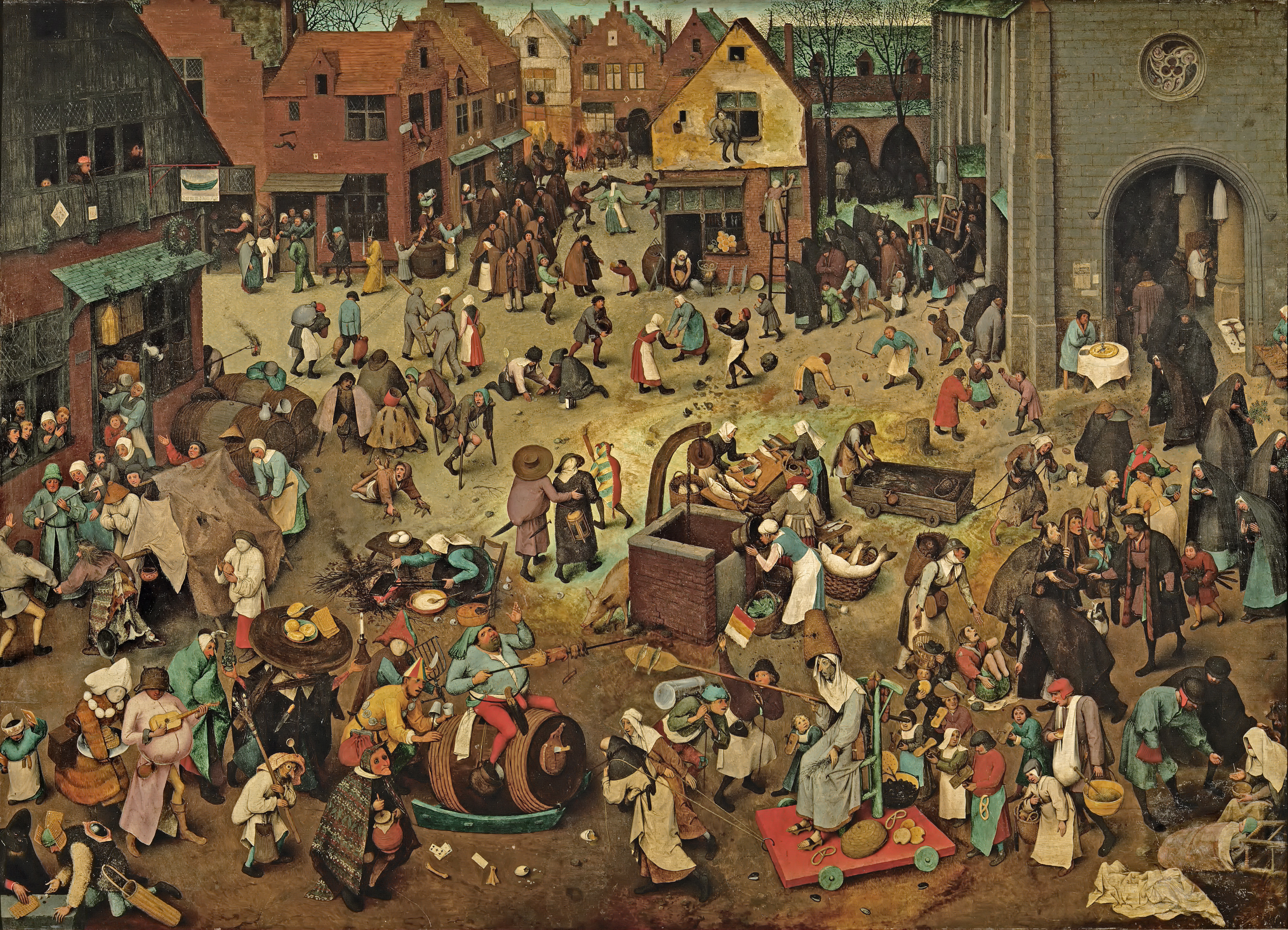
Bruegel's genius is subtle. Then again, it's really not. The chaos in this picture is evident. Like so many of Bruegel's other paintings, the viewer becomes distracted by the chaos, thus the subject is lost to them (i.e. The Fall of Icarus where a man peacefully plows in the foreground and Icarus, unnoticed, drowns in the bottom right corner). In this particular painting, the focus is just as unclear, despite Bruegel giving it to us in the title. The spectrum is broader; the subject busy and chaotic.

But Bruegel doesn't take sides. He sits behind his paint brush and his wit, observing the utter chaos in front of him. He depicts the convergence of a religious contrast. On the right side, there is a church, religion and order, representing Lent, a time of solemnity and purity. Hunched over nuns walk about the street looking sickly and forlorn. On the left, an inn where the drunk and foolish stumble out.

It kind of boggles my mind to think that Bruegel never got in trouble for this painting. He depicts two different religious days as a mockery, ridiculous through every aspect. Despite all this, he was considered a pious man, but this only impresses me. Throughout all of history, Bruegel is one of the brains I would look to pick the most (right behind Oscar Wilde). To me, he's that guy at the back of the party that's just there, watching and observing the comedy in every day life

  • 7:00 AM

The Great Piece of Turf

The Great Piece of Turf would make a terrible superhero name. Good thing Dürer is his own favorite superhero.
Albrecht Dürer, The Great Piece of Turf, 1503

Leave it to Albrecht Dürer to make grass look divine.

Really, in almost any other context or with any other painter, a painting of turf would be exactly what you'd expect it to be--lifeless, plain, or insubstantial. But left to Dürer (read: Jesus), being a self-styled king among artists, it gains a depth, weight and an unexpected experimental edge that no one would've expected otherwise. But to anyone not looking deeply enough, it's turf. Gorgeous turf, but turf nonetheless. But let's just get one thing clear before going on:

Not looking is a grave mistake.

The most immediately interesting thing that Dürer presents comes in the form of the plants themselves. Full of life and variety, the collection lacks the uniformity of "regular" grass. While there are patches of similarity, they're punctuated by smaller sprouts that pop up and vie for the sunlight. Dürer captures this push for life perfectly, even without including external imagery like a sun or a sky. In addition to that, each plant is rendered in painstaking detail, to the point where even modern photographic technology struggles to match it. It's amazing even now to think of the hours, the days, that Dürer spent gazing at the ground, hoping to God (read: himself) that he could render it correctly.

But aside from this, there can't be anything else interesting about this painting, right?

Wrong.

Aside from the variety Dürer brings to this turf, there's also a wonderfully subtle degree of depth lent to the painting that helps it feel real, in a way that many nature paintings (or Renaissance paintings in general) lack. The leaves of the plant (please excuse my dearth of horticulture knowledge) sit elegiacally at the front of the painting, contrasting with the urgency that the sprouts provide.
Good god look at the depth!
Albrecht Dürer, The Great Piece of Turf (detail), 1503

There's almost a spiritual component to it in that the hierarchies that prevail throughout nature feel so perfectly rendered and accepted. Even the dirt, created using jarringly experimental watercolors, feels in place. Despite featuring an amazing amount of variation and detail, the painting never feels cluttered or forced, everything is in its right place. But aside from that, there's a certain tranquility to zooming into any part of the painting and finding a new layer or new bit of detail.

Ultimately, this painting demonstrates a lot of things. First and foremost would be, to most, Dürer's outstanding ability as a painter (mind you, this is post Jesus-self-portrait), but it also showcases a lot of the ways that the Northern Renaissance represented a mindshift.

In the North, there was a greater shift towards tangible, secular ideas, a recognition of science and economics and brutality. But this shift wasn't absolute, and there are bits of spiritual and religious tradition that slip into a lot of otherwise secular paintings. But this painting demonstrates the merging of the two traditions, that there could be something divine, something transcendent, about an absolutely scientific painting of grass.

All of that in a painting of grass, and you'd be crazy not to look deeper.

  • 7:00 AM

The Garden of Earthly Delights

Hieronymus Bosch, The Garden of Earthly Delights (Closed), c. 1504

Hieronymus Bosch.

My personal Jesus Christ. 

From here on out, the timeline of my life will be laid out according to the day I first discovered Bosch's brillance. My own "revelation" so-to-speak. Instead of 1300 B.C, It'll be 1300 B.B (Before Bosch). And this painting--this masterpiece, is both the beginning and the end, the first and the last, of everything I am and everything I will ever be. 

Truly the epitome of perfection, each brushstroke of  The Garden of Earthly Delights is enough to reduce someone to tears.  In fact, I may have teared up a little bit just uploading the photos. With a painting so tragically beautiful and devastatingly stunning, who wouldn't get a little emotional?

To own such a painting, would be to own the universe. 

One of the great tragedies of The Garden of Earthly Delights lies in the myriad mysteries woven through it's much debated history. Who was Bosch? What was his intention? And, What the hell is that?! 

Hieronymus Bosch, The Garden of Earthly Delights (Open), c. 1504

After scouring every inch of it  I've found the real tragedy is in it's complexity.

At first glance, one may see a jumble of naked people, vibrant life-sized fruits and eerie-nether-creatures straight out of the most blood-curdling of nightmares. But, the longer you look, the more you begin to see queer, and curious things: an Albino giraffe with dragon horns, Men and women of all races, running about in the nude, indulging in both fruit and each other, or a man, head stuck under an avocado-lute, his butt tattooed with the score for some 600-year-old-butt-song from hell. 

The beauty, mind you, is in the details. Alas, only very few will ever have the opportunity to fully experience them. Nothing does it justice (trust me, I've tried everything). Printing it mutes the colors and diminishes the details, tracing or copying it in any way proves fruitless (no pun intended) every time and don't even get me started on the disillusionment generated by attempting to view such a gem on a computer. 

Ceci n'est pas un jardin des plaisirs terrestres. 
Ceci n'est pas perfection. 

The notion that one man could fantasize such things, and execute them so flawlessly, is beyond me. With no access to the internet, no access to LSD (I hope), and previous demonstrations of surrealism,
Bosch just dreamt everything up with sheer brainpower. 

If we found a way to harness it, we could fuel the universe on Bosch's imagination alone.  
And that gives me hope.


  • 7:00 AM

Hunters in the Snow

Pieter Bruegel the Elder, Hunters in the Snow, 1565

Please use this painting as a holiday card. 
Sincerely, Pieter Bruegel. 

A similar message must have been written on the back of Bruegel's Hunters in the Snow, since nearly every bucket of holiday popcorn is accompanied by this postcard with a message that proclaims A Warm Fire and the Warm Love of a Family, who needs more for Christmas? Nonetheless, Hunters in the Snow, is a masterpiece, but does not necessarily remind me of a warm cup of cocoa. 

As a composition, this piece works beautifully. The fluent slopes of the mountains, combined with the diagonal movement of the trees creates a pleasing peaceful feel. However the pleasantness dissipates with the contrast of the harsh winter overshadowing the presence of man. Although this would seem like a secular piece, Bruegel's signature depth gives a omnipresence sense of spirituality combating the human experience. The overwhelming presence of nature calls attention to the smallness of man. To the point where A Warm Fire and the Warm Love of a Family seems oddly soft for the intensity of this painting. Survival comes to mind before christmas  sentiments, however I suppose that's just as fitting for the holiday period.

The normal concept of subject is lost in this painting, as it is in most of Bruegel's work. The hunters, supposedly the subject, act as a frame for the ice rink behind them. Almost as if the subject itself is the scene, and the hunters behave as a setting, telling the story.

  • 7:00 AM

Nemesis

 Durer, Nemesis (The Great Fortune), 1503

Look at those child-bearing hips. Durer depicts Nemesis, the goddess of revenge, as the perfect woman. She has large hips and a plump stomach signifying she would be a great bearer of children; in other words the ideal wife and woman. Some features distract from the fact that she is supposed to be a woman. Her legs are muscular to the point of believing it is a man. Her face does not look like one of a goddess, it is smug and she looks unhappy. She does not look like a beautiful woman but instead a man who is in pain.

Nemesis believed no one should have an abundance of unnecessary things and cursed people who did. She stands above a town on a globe with a goblet in one hand and reins in another. Seems a little contradictory to me. If you believe people should not have luxurious objects, why not be depicted on the ground with all the other common people. In addition, why be depicted with a fancy golden cup and reins?

Durer includes this engraving in his series of studying the anatomy of humans, birds and other animals. He leaves the background at the top white so the attention stays on Nemesis then drifts towards the ground where there is a small town. Nemesis has overtly large wings that are similar to those in Durer’s Wing of a Blue Roller.  Because there is no background, the oversized wings take over the left side of the painting. Personally, I enjoy looking at this painting. The complexity of the bottom half contradicts the simplicity of the top half to a wonderful extreme.


  • 7:00 AM

Adam and Eve

Albrecht Dürer, Adam and Eve, 1507

Though contemporary ideas about the "ideal figure" has changed radically throughout history, our fascination with it has hardly faltered. Albrecht Dürer sought to identify this body, immaculate and supreme, in his portrayal of the first humans: Adam and Eve. Though Dürer’s competence for painting takes its place in other Dürer artworks, the above happens to be an engraving. As Adam and Eve are often depicted as the paradigm of human perfection, Dürer’s undertaking of this subject called forth his knowledge of proportion, symmetry, and other artistic techniques to accumulate into this engraving. Dürer believed that an artist could achieve a higher understanding of their creations by expanding their field of knowledge to other subjects. Naming this artistic notion kunst, Dürer applies his self-invented theory to Adam and Eve.

Scouring through Adam and Eve at close proximity, one can’t help but marvel at the sheer amount of detail hidden in every millimeter. Dürer’s intention to capture the quintessential man and woman did not fall short, but to ignore the rest would be an injustice. Accompanying the two humans, various creatures crowd around the two. Yet, despite their animal instincts, they sit in peace. The cat, settled comfortably between Adam and Eve, seems to pay little attention to the mouse near it. Even nature is involved in the parity between all living beings, as the middle tree acts as a split between Adam and Eve to symbolize their balance. Only the deceitful serpent exists as a partial being in this idyllic sanctuary.

Dürer’s primary goal for Adam and Eve was to capture the intricacies and shape of the principal human figure. For starters, he seems seems to channel Apollo as a point of reference for Adam. This is evident in Adam’s highly precise muscle definition, especially noticeable in his torso and the darkened areas of his legs. In contrast, Eve’s legs are soft and untoned. Additionally, their arms are meaningfully positioned to juxtapose one another. Adam’s left arm grasps onto a branch, while Eve’s right hand discreetly cups around a fruit as her left hand reaches out to receive the snake’s apple as well. Impressively, Dürer details their arms with realistic, striking veins, highlighted by the medium in which they are presented in. Eve’s exaggerated hair flows back and weaves together in a braid-like motion. Adam’s curls spiral about his scalp with a peculiar neatness. In seemingly every way, the two are distinguished as opposites.

So, has Dürer achieved his goal of interpreting the ideal figure? Even if he hasn’t, he’s certainly worthy of applause. No piece subsists without its flaws. The fingers on Adam’s right hand may be at a slightly wrong angle, and Eve’s right leg bends oddly — still, does it matter if he’s truly captured anatomical perfection? Dürer’s achievements with this particular engraving almost certainly outshine his slight mistakes.

  • 7:00 AM

Landscape with the Fall of Icarus

Pieter Bruegel, Landscape with the Fall of Icarus, 1595

At first glace, Pieter Bruegel’s Landscape with Fall of Icarus illustrates in great detail, a distinct perspective drawn from the ocean’s horizon to the stone pathway in the front, the birth of spring, and like in many other of Bruegel’s paintings, a peasant tending to everyday chores like plowing. However in the bottom right corner is the faint splashing of a drowning Icarus.  As Bruegel paints Icarus’ fast disappearing legs as a minor detail, the Northern painter strategically undermines the observers by challenging them to look deeper into that of the composition and reflect on the Bruegel’s intentions of integrating this tale Ovid into his 16th century painting.

For those of you unfamiliar to the legend of Icarus, it begins with Icarus’ ability to fly from imprisonment when his father Daedalus makes his son wings out of feathers and wax. While Daedalus warns Icarus not to fly too close to the sun, Icarus ignores his father’s orders and nevertheless flies so close to the sun that his wings melt, and he falls into the sea and drowns.

In Bruegel’s composition, Icarus’ death goes seemingly unnoticed in the birth of spring as the farmer focuses on his horse leading them back to the city and the Shepard stares up into the sky. While the peasant in the bottom right corner seems to acknowledge the drowning prisoner, he does not take action. The artist has further utilized the setting sun and the laxness of the peasants in regards to Icarus’ death to symbolize the insignificance of one individual in comparison to the vast landscape.

William Carlos Williams supports this in his poem, which takes the same title as the painting. “…sweating in the sun that melted the wings’ wax unsignificantly off the coast there was a splash quite unnoticed this was Icarus drowning”.  His poem does not dwell on the imagery of the painting, and his lack of punctuation understates Icarus’ plunge into death. As Bruegel composes an ordinary life for the peasants, as they tend to daily activities that allow them to survive the best they can, Bruegel draws attention to the northern humanism in which there was less of a focus on education. The poem ends harshly to reflect the lack of empathy for Icarus in the painting. Moreover, he portrays Icarus’ death as a punishment for his self-absorption and defiance of his father’s respectful advice. With that, I believe that Bruegel has blatantly showed his observers the painful irony of death, in hopes to demonstrate the insignificance of selfishness in the midst of life.

  • 7:00 AM

Isenheim Altarpiece


Matthias Grunewald, Isenheim Altarpiece, 1512-1514

The Isenheim Altarpiece was created by Matthias Grünewald for the hospital of Saint Anthony's Monastery in Isenheim. The altarpiece when closed shows a version of the crucifixion unlike most we have seen. The grotesque detail of Christ's body, his torn flesh, distortion, and blood, is horrific and captivating.This altarpiece helped the patients have a sense of community and gave them a feeling that they were all suffering together in relation to Christ's suffering on the cross. This Crucifixion was shown on weekdays and the opened altarpiece on Sundays.

The reality of this painting is seen in the deep emotion Grünewald's paints in his figures. Mary Magdalene is falling to her knees in agony, the Virgin, held by St. John the Evangelist is overwhelmed with sorrow. The ominous sky and deep umber tones in the rocks in contrast to the light cast upon Christ's body also add to the somber mood.


When opened the mood is suddenly uplifted with the joyousness of the resurrection of Christ. Warm, rich colors and bright lighting contrast from the closed altarpiece. It is divided in three panels. Annunciation, Angelic Concert Nativity, and Resurrection. On the left in Annunciation, Mary is told of her destiny of bearing the savior Jesus Christ. Her facial expression is a mix of sadness and understanding. The nativity scene in the middle panel shows the Madonna and child sitting on the tabernacle steps welcoming salvation to the world. Finally, the third panel depicts Jesus resurrected from the dead, rising in front of a glorious sun, triumphant, and bringing redemption to mankind.

  • 7:00 AM

Adoration of the Mystic Lamb

Jan and Hubert van Eyck, Ghent Altarpiece, 1432


Jan and Hubert van Eyck, the dynamic sibling duo of the 15th century, began work on the Ghent Altarpiece in 1425, eight years before completion. Hubert, the elder Eyck, was commissioned to paint it for the private chapel of a wealthy Flemish businessman. After a year into his work, Hubert died and left the legacy of the painting to his brother.

The Altarpiece can be viewed in two parts – open and closed. In its closed state, we see a scene of the Annunciation above four statuesque figures. Both the Angel Gabriel and the Virgin Mary appear to be solid and heavy, due primarily to the heavy draping on their robes. The figures sit on separate panels and are separated by the emptiness of the middle panels, instead of a pillar or some sort of obstruction like we see in Fra Angelico or da Vinci’s rendition. The heaviness on the sides and emptiness in the middle balances the painting, as if it is on a scale. The statue effect in Gabriel and Mary mirrors the “statues” of John the Baptist and John the Evangelist on the lower middle panels. At first glance, the shadows and depth of the panels make the painted figures appear to be 3D, as if they are actual statues. On the lower left and right panels sit the patrons of the altarpiece; notably, they are the only figures in full color. John (Baptist) and John (Evangelist) seem to nod at them, as if paying respects to the wealthy couple.

Jan and Hubert van Eyck, Adoration of the Mystic Lamb, 1432

It is when we open the Altarpiece that we see the true brilliance of the painting. Such luxurious colors and extravagant details were not found often in 15th century religious paintings. The inside polyptych’s title, “Adoration of the Mystic Lamb,” refers to the lower central panel in which various saints, bishops, and prophets sacrifice Christ’s lamb. The huddled groups on all four corners of the painting make an “X,” with the lamb in the intersection so that it is the central figure. The lower clusters of people push viewers’ eyes along the robes of the angels surrounding the lamb, and thus push the eyes (and the lamb) up towards the heavens (as if the top of a large triangle). It just so happens that at the top of this triangle, in the central top panel, is God himself. This placement was definitely intentional, just like every deliberate detail that Eyck painted on his masterpiece.


  • 7:00 AM

Know Your Chapeau: Mrs. Siddons

Thomas Gainsborough, Mrs. Siddons, 1785

Considering the multitude of textures and color palettes in Gainsborough’s Mrs. Siddons, an observer has no reason to focus on the subject’s black chapeau, yet it draws the eye more effectively than any other element of the work. Gainsborough applies incredible richness in the red backdrop, and he designs textures that appear as real as an actual fur coat and capture the drama of a tragic actress like Sarah Siddons. His wholly different patterns and contrasting colors fill the work in a way that adds dignified intimacy without chaos or claustrophobia.

Gainsborough captures the softness of this renowned tragedian’s face with incredible care, and he most likely spent more time on this portion of the painting than any other. After weeks of effort on her proboscis alone, he exclaimed, “Confound the nose, there's no end to it!”

What about this hat, though? The striking black as well as its size and shape repeatedly steal attention away from the masterful beauty of the rest of the painting. Since this hat lacks the ornate texture of every other material in the portrait, it stands out even more than it would just by virtue of its enormity. The blackness has a peculiar effect, because this color ordinarily serves to define the brighter hues around it, but, in this case, it contrasts with every other part of the painting and creates a sort of void that provokes thought and further consideration of the work. So, well done, Gainsborough. By creating a hat, you keep people’s attention long enough for them to see the excellence of this painting.


  • 7:00 AM

Know Your Chapeau: David

Donatello, David, 1440?

Donatello's David, renowned as the first free-standing bronze sculpture of the Renaissance, was quite controversial at time of release. While heralded as a great modern (at the time) work by some patrons, others considered it risque, especially in its nude and effeminate depiction of David. But one thing about the statue that has drawn considerable attention is David's hat. Being the only real article of clothing on the statue, it was bound to be imbued with speculative myths and hackneyed meaning.

But the actual hat itself is also quite enigmatic. The design of the hat is anachronistic of the time, it being more of an Italian mercenary's hat than anything that could have come out of the Biblical Era. And while the rest of the sculpture screams masculinity ...not, the hat at least conjures up the image of the violent Goliath and his supposed indomitable nature. But then there're the flowers.

While the hat itself seems out of place, what's weirder still is the presence of laurels and other flora. Taking an anachronistic hat and putting laurels (which are native to the Mediterranean region) on as accents seems like a bold move. But, this may make the sculpture better, at least historically. Unlike the Davids of other artists (read: Michelangelo), this David may indeed be more adherent to the Bible, depicting David as a somewhat weaker-looking person. In the narrative, David's weakness is extolled as a virtue, making its symbolic depiction here seem intentional.

  • 7:00 AM

Know Your Chapeau: Portrait of Saladin

Cristofano dell’Altissimo, Portrait of a Saladin, c.1525-160

Hat's off to Señor Cristofano Dell'Altissimo for his cap-ital effort creating this fedora-ble painting full to the brim with cap-tivating mystery as to what kind of hat-astrophe has found itself on Sultan Saladin's head.

If you're already tired of the hat puns please feel free turban me now because it's beanie a long night coming up with all these.

There's a bit of a humorous hat-mosphere to this painting that I can't quite place. I don't want to find it so humorous, Saladin looks so serious and frankly, a bit dis-turban-ed. But the fancy-towel-animal-octopus-crown-thing on his head makes it a bit difficult to be sympat-hat-ic.

It may be way over my head, but I haven't been able to find a single turban style similar to his anywhere. Even other sources describe him as wearing a white and gold turban with a single point at the top and a gold crescent in the middle. Cristofano Dell'Altissimo was known as "The King of Copying" for all his portraits were strictly copies of other other artists' portraits and/or copies of copies. Therefore, one can only guess he got his ideas of haberdashery from some T-urban Legend or something.

Overall, Dell'Altissimo's use of muted and somewhat brim color pallet paired with Saladin's outright sombre-ro indisposition comb-hat-s with the fez-tive hilarity and flagrancy of his headdress to a point of utter frustration. Why Dell'Altissimo thought it was smart putting Sultan Saladin in some headpiece, obviously straight from Turban Outfitters, is beanie-th me. Personally, I feel the first Ayyubid Sultan of Egypt deserves better.

Hat's everything I have to say.

Thanks for bearing with me. Hat's real sweet of you. I'm Trilby sorry for all the puns but it hat to be done. For those who made it to the end: Hip hip Beret! And for the rest- well, hatters gonna hat.

  • 7:00 AM

Know Your Chapeau: Lady Peel

Sir Thomas Lawrence, Lady Peel, 1827

Belonging to the age of Romanticism and what was known as the "golden age" of British portraiture, Sir Thomas Lawrence displays his instinctive skill of depicting the British mannerisms in his subjects. Observing his father's tavern customers as a child, Lawrence quickly picks up on the characteristics of the rich and poor men and women-- especially the fashionable female ones-- and takes on a career as a draughtsman at the age of 10.

With Lawrence's unique sense of Romantic style, the English painter takes a new approach to his painting techniques that nevertheless parallels to emotion seen in numerous portraits in art history. In almost all of his paintings we see a dreary, storm-like background. His subjects stand out in their unique clothing styles and Lawrence's choice of palette, which often times contrasts heavily to the background as a result of the glimmering highlights.

In Sir Thomas Lawrence's Lady Peel, we see a prime example of the painter's fine work. Undoubtedly, the painting follows Lawrence's uniform portrait stencil with a gloomy sky for a background that contrasts to the woman's darkly-draped clothing and her flamboyant red hat. However, I chose this painting not to focus on the fierceness of her hat, but to address how Lawrence effectively utilizes this hat along with her fur coat and gold jewelry as a juxtaposition to the softness that is captured in Lady Peel's face.

The red hat frames the woman's angelic facial expression and compliments the rosy flush in her cheeks. Lawrence paints highlights in the woman's eyes, which look straight at the viewer, to give the piece a somber feeling. To be honest, Lady Peel looks miserable. Maybe she imagined Lawrence to be much some dreamy rugged painter and was dissatisfied with his appearance? Or maybe it's the layers of heavy clothing that make her so uncomfortable that she can't conceive another expression?

Regardless, I believe that Lawrence tries to parallel this unhappiness in her face to the Eurocentric significance that is put on one's status of wealth during the 1800s. By having Lady Peel dressed in expensive attire, the painter might be implying that materialism does not effectively fill these voids of human identity, which everyone searches for at one point or another.

I'm sure in this century many of us wish to rock the hat-game that Europe's elite created in the early 1800s. However, it's important to reflect on the implications of Thomas Lawrence's work, that so perfectly addresses the worthlessness of materialism relative to modern day society.

  • 7:00 AM

Know Your Chapeau: Femme Au Chapeau

Henri Matisse, Femme Au Chapeau, 1905

Henri Matisse depicts his wife Amelie Matisse in his 1905 Femme Au Chapeau or Woman with Hat. She poses with a fantastic fan and honestly a fabulous hat that I wish was a part of my wardrobe. Amelie Matisse sayid in a 1906 interview that her outfit was completely black when her husband painted her. She always wore black, but her husbands eclectic mind put this painting to a new level of excellence.

Little did I know while researching crazy hats that this painting that I loved was a transition point in Matisse's career. This painting is typical of a Matisse, the brush strokes and the colors make it unmistakable. This painting is different because it was the star of his 1905 show that started a modern art movement called fauvism. Fauvism is French for "wild beasts." This art movement was an avant-garde style that used color to emphasize certain qualities of the subject. Another famous artist of this time was Andre Derain. The subject was simple but had a certain amount of abstract to set it apart from other works of modern art. 


  • 7:00 AM

Know Your Chapeau: Margot in Blue

Mary Cassatt, Margot in Blue, 1902 

Mary Cassatt, an American Impressionist painter, was known for her paintings depicting mother and child bonds and the lives of upper class women. I found her story similar to Edith Wharton's in that they both came from wealthy families who warned their respective daughters about a career in writing or art. Such occupations were certainly not a path for women of their class. Cassatt's father even said he would rather see his daughter dead than living abroad as a "bohemian." I greatly appreciate Wharton and Cassatt's dedication and passion that led them to be amazing influential women of their time.

Margot in Blue is a beautiful and charming portrait of a young girl in quite the extravagant bonnet. This hat is about four times the size of her face and gives off kind of an eskimo vibe, but I guess this is what Daddy's money could buy at the time. The girl looks tremendously pleased with her outfit and sits poised and with confidence. Cassatt uses pastel (influenced by Degas) and a bright palette. The background is solid and dull in contrast to the brightly-colored subject.

  • 7:00 AM

Know Your Chapeau: Party Hat

Kenne Gregoire, Party Hat, 1951

I believe the quality of one's hat cannot be judged based solely upon the head-wear's physical appearance, but by the attitude of he who wears it. After all, it is the person who wears the hat, not the other way around. So, with this in mind, my adoration of Kenne Gregoire's Party Hat grew quite strong.

I choose this piece specifically for the story it told. The use of hats as symbols of larger themes, for this case youth or loss of innocence, produces a strong image. A loss that anyone with the ability to think about has thought about, the image transcends social boundaries. Seen through the intensely defined sad look in the man's eyes, the hat fails to bring the happiness it might have brought in the man's childhood. However, what really threw me was why his face and ears were so small compared to his head. Almost as if to reflect the unhappiness with his old body, Gregoire keeps the man's face and ears in proportion to the hat, a representation of the man's longing for his youth, rather than his overgrown, physically wrinkled body.

With deeper themes aside, the simplicity of the party hat itself in comparison to the large wrinkled man who wears it, is laughable. And in the craze to find the craziest hat, Party Hat contrasts the majority of over the top extravagant hats, ultimately making it the most eccentric.

  • 7:00 AM

Know Your Chapeau: Pinkie

Sir Thomas Lawrence, Pinkie, 1794

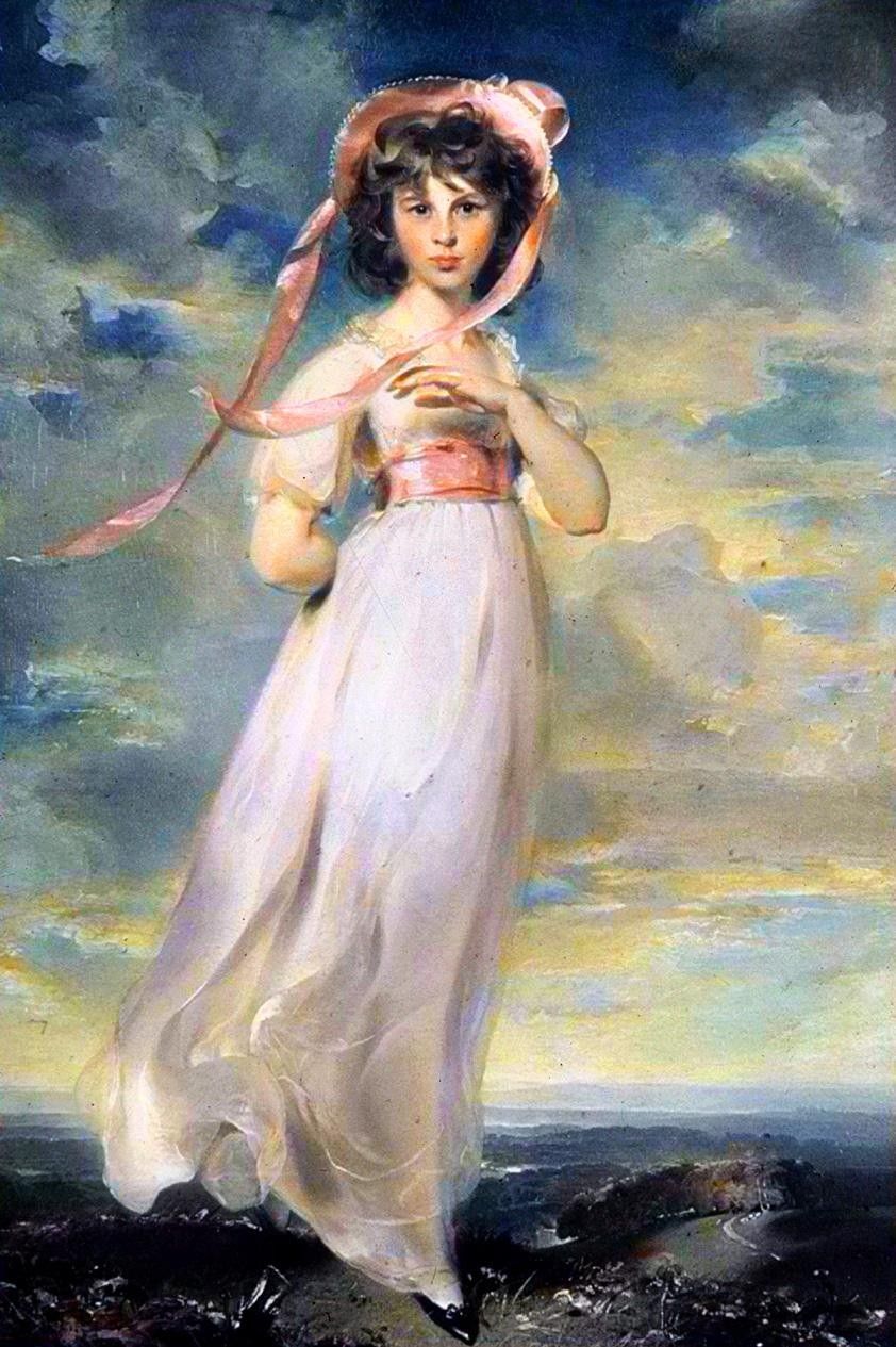
Sir Thomas Lawrence, an accomplished portraitist, painted Sarah Goodin Barrett Moulton in 1794 when Sarah was eleven years old. Given the nickname Pinkie by her family (which I think is up there alongside Keith, Myrtle, and Bing on the list of horrible things to call your children), Lawrence played off of the nickname, giving his subject a soft, rosy complexion. Dressed in pink, young Sarah stands on the rocks poised, looking off among to the distance.

Pinkie and Thomas Gainsborough's more famous Blue Boy have been seen as a package deal before. In the 1960s, the two paintings were sold together as cheap home decor. Today, the two portraits hang beside one another at the Huntington Library in California. Although I’m not particularly fond of either painting, that feeling changes when you put them together. They complete each other. Lawrence clearly intended to juxtapose his painting with Blue Boy, seeing as how they were painted only fourteen years apart. Dubbed the “Romeo and Juliet of Rocco portraiture,” Pinkie and Blue Boy thrive together, but wilt when apart.

  • 7:00 AM