Bad Boys – Brunelleschi's Dome


Bad Boys
The Men Who Saw Art and Chose To Change It
Curated by Gabrielle Fenaroli

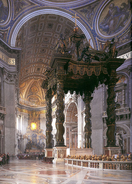
Brunelleschi, Florence Cathedral, 1418

Florence decided it needed a large cathedral, not to rival Rome, of course, who would do such a thing? Merely, to have a place in which its citizens could worship. It just so happened that the cathedral they were building required a dome with a 143 feet diameter and if it happened to be larger than the Pantheon, well, whose coming to Florence anyway? The only problem was no man was brave enough to complete the task without fear of his plan collapsing. So in 1418 a competition was held to decide who would put their name on the line to create one of the most monumental features in all of Florence. The winner was a cocky, irritable clock maker named Filippo Brunelleschi, whose arrogance was matched only by his skill.

Brunelleschi’s idea was to create a dome with an octagonal lantern with eight flying buttresses and eight arched windows. Brunelleschi invented numerous devices to even begin the construction, which involved hoisting over 70 million pounds of material hundreds of feet in the air. The most common way of building a dome in the 1400s was to support is with scaffolding called “centing,” but because of the large, open area inside the cathedral, the citizens wanted something large and noticeable. There was not enough wood in all of Northern Italy to build scaffolding large enough to support the dome the Florentines wanted. So, Brunelleschi decided to create a dome that supported itself as it was built. The dome would occupy most of Brunelleschi’s life, but also serve as his proudest achievement.

  • 7:00 AM

Structure and Paintings: Avenue of Schloss

Structure and Paintings
Analyzing Architecture and Perspective within Paintings
Curated by Max Cantu-Lima

Gustave Klimt, Avenue of Schloss, 1912

"Technological changes paired with economic forces are significantly altering the construction of buildings and the practice of architecture. Conventional techniques will no longer suffice if architecture is to remain a viable venture."   -
Monica Ponce de Leon

The final painting of this collection will not actually be a painting of a physical building but rather an abstract one. Heading into the architecture field, there has been one important concept that I've learned by applying to schools and that is: The way we view architecture today is out-dated and needs to move toward ecologically friendlier designs where a building is more concerned about the environment around it. Buildings need to be more self-sufficient and waste less energy. 

I chose this Gustav Klimt because the trees themselves are acting as structures or at least natural ones. The way the branches stretch up with those hard lines, these trees are sturdy giants. The abstract meaning of this is that buildings need to be more natural, yet still beautiful. The colors Klimt captures with his impressionistic brush strokes creates a shade from the sun that invites you to the actual building in the background. Both work together to make a beautiful scene. But this is only accomplished by the trees working together. The sun would easily break through the branches if the amount of trees were not close together working collectively to shelter the walk-way. 

The way buildings will look will change, but the drive to make them look attractive to the eye will not, because architects are artists, sketching drafts that would eventually conceive a building. But also taking into account other details like its surroundings and its purpose. Monica Ponce de Leon is the dean of the architecture school in Michigan and say, "Our teaching methodologies and the predominant model of studio instruction has remained virtually unchanged for over 100 years. More importantly, in the last 20 years, architecture has stagnated in research that narrowly focused on topics that proved to have little consequence." What she's saying is that the field of Architecture is in need of reform. That a massive change is on the way. Designs will soon be approached with a greater interest as to how it will impact its surroundings, as well as its use of resources.


  • 7:00 AM

Structure and Paintings: Musical Fete

Structure and Paintings
Analyzing Architecture and Perspective within Paintings
Curated by Max Cantu-Lima

Giovani Paolo Panini, Musical Fête, 1747

"Design an architectural space to accommodate a specific program, experience, or intent." 
#12, 101 Things I Learned in Architecture School, Matthew Frederick

Giovani Paolo Panini was both a painter and an architect. His better known work consists of paintings of Rome's ruins when he had traveled there. In France he became famous for decorating palaces. As an architect Panini had an understanding for form and shape, so the composition of his work comes to no surprise. The painting is brilliant. You view it straight on as a fellow spectator as the show carriers you away. The perspective of the auditorium engages your eye with the red leading to the cool colors of blue and grey up to the holy yellows. The show must be quite good for the crowed is transfixed.

Little is actually known about Panini's work because he's just not that popular. But his work demands more attention. It creates space and detail that leads the eye across the canvas from one end to the other. The symmetry and balance displays an understanding of art. Just look at those chandeliers and the way the jewels sparkle. Every inch of this canvas calls for your attention, as each brush stroke behaves like an actor demanding your observation.

This painting needs more recognition. It's captivating. The reverberations of the instruments can almost be felt even through the computer screen. The contrast between the low cello strings and the sweet sounds of the violin. All working to complement the voices singing to the audience. Panini's painting has an organization of shapes that move the way the music does to accentuate the stage. The sides of the canvas open up as if ready to embrace you into a spectacle. The way it has done with everyone else.  The show goes on. You are not the first to see it, nor will you be the last. The show is captured in a never ending state of action, playing all the time. Waiting for you attendance.


  • 7:00 AM

Structure and Paintings: School of Athens

Structure and Paintings
Analyzing Architecture and Perspective within Paintings
Curated by Max Cantu-Lima

Raphael, School of Athens, 1509-1511

"A object, surface, or space usually will feel more balanced or whole when its secondary articulation runs counter to its primary geometry." 
#88, 101 Things I Learned in Architecture School, Matthew Frederick

By now we've fully covered the concept of space and perspective. But what Raphael does within School of Athens is quite different, which propelled it to its popularity. Raphael does not solely focus on the architecture, but depicts philosophers and authors of the time. Center stage we find Plato and Aristotle discussing the difference between idealistic world-views and the greater concern with the real world. The scene itself has become iconic, brought up commonly within philosophy classes and even making its way into pop culture as the inspiration for alternative band Alt-J's music video for Tessellate. And while the subjects are done well and cleverly, the architecture behind these great minds stands tall, towering over them. For in the end, the building will last longer, outliving all of them. Its beauty remaining for future generations to see.

Raphael widens the space he was restricted to working in, making the work seem larger than its true size. He not only increases the size, but also extends it further back creating even greater depth. One indication as to the talent and genius of Raphael, are the gaps Raphael places between the barrel arches. He's creating a more complex image by doing so, separating the perspective, almost vertical, lines with horizontal ones. He does this in sets of three. This not only creates more space, but more appealing space, while also allowing the sky to peek through. It's successful because of the way he utilizes color and shadow, capturing how light plays off the walls and columns.

This painting made its way into this collection, like other paintings, for its attention to detail. Raphael became a classical master because of this painting. With this statement, I am not saying his other work lacks talent but rather this painting has so much of it in one space it has become his most remembered. Both symbolic and executed well, Raphael's complexity creates a work that the viewer could analyze for hours.


  • 7:00 AM

Structure and Paintings: Tower of Babel

Structure and Paintings
Analyzing Architecture and Perspective within Paintings
Curated by Max Cantu-Lima

Peter Bruegel, Tower of Babel, 1553

"A dynamic composition encourages the eye to explore."
#40, 101 Things I Learned in Architecture School, Matthew Frederick


Peter Bruegel has been the most influential artist on how I view art. This painting relates directly to Paul Auster's City of Glass, which we read in our AP Literature class and concerns itself with the issues of identity and purpose. The Tower of Babel plays a role in the narrative of this novel with the fall of language, stating that our language has lost its meaning. While this may be the case, Bruegel speaks with a universal language of color, inserting light blues, yellows, and reds within the painting to give it that burst of presence from the stretching horizon of green. The beauty of this painting is the chaos that takes place as these workers attempt to construct this monstrosity. The viewer could lose themselves within the minute details of Bruegel's work.

I have chosen to write over The Tower of Babel as our fourth painting as we analyze architecture because of its creativity. Bruegel produced this from his imagination. Sure he probably was inspired by the Roman Colosseum, but still, to produce this intricate world of workers that live on this building like bacteria inspires my creativity. The viewer can see the process of how the construction is taking place as most of the top is left exposed. Also the levels of the tower as they progress differ in the style of arches. What the painting attempts to instruct, in my mind, is the concept of being able working with others effectively as well as narrowing in on an idea. That no matter how great the idea is, if it's to big of an idea, your infrastructure is at risk of collapsing.

Bruegel is truly a master. Just look at how he produces the stones in the foreground and the sprawling landscape. The time he invests into getting all the details right. The coast and the ships proportionally correct. This imaginary world invites the viewer as it utilizes the majority of the canvas with interesting subjects to analyze. While it's only a two-dimensional picture, even with the paint you still feel that sensation of  "Wow." Gazing at this structure the mind still wanders off. Its nearly impossible not to think of something from this painting. The depth Bruegel is able to produce with his use of shadows brings the painting to a semi-real state of being, we begin to believe the narrative Bruegel is telling us. That's what makes him and this painting great. The fact that we can lose ourselves within it, and while all art does that to some degree, Bruegel makes it effortless.


  • 7:00 AM

Structure and Paintings: The Little Street

Structure and Paintings
Analyzing Architecture and Perspective within Paintings
Curated by Max Cantu-Lima


Johannes Vermeer, The Little Street, 1657


"Space planning is the organizing or arranging of spaces to accommodate functional needs."
#13, 101 Things I Learned in Architecture School, Matthew Frederick 

Our next stop on the use of architecture within paintings covers the idea of material and sustainability. A large detail that decides the structure of a building is its material. Choosing this, the architect must take into consideration the location and weather so that the building will not be at risk of collapsing due to infrastructure complications. The use of brick has been the longest and strongest building material used around the world, its first appearance in Europe found in Greece during the twelve century. During the Baroque period, beginning around the year 1600, exposed brick went out of popularity. Brick work was instead covered with plaster. Brick was often the material of choice for economic and time reasons.

Vermeer is truly a master with the brush. His paintings contain such a level of detail that from a distance his work could be confused with photographs. The style which he paints this home, varies between thick application on the shutters, to the dabbing on the brick where the canvas peeks through in certain spots. The Little Street is a little painting that depicts a common place building in Delft. While the painting is quite famous, little is actually known about it. Whether this building ever existed is still disputed to this day as art historians attempt to trace back through history. Regardless of its actual location, the building appears worn down by time and weather. Uncharacteristic for Vermeer, who mostly painted portraiture,  produced a painting within the city he had recently painted before hand, A View of Delft.

Besides the incredible portrayal of detail, Vermeer captures the beauty of the common wealth home. The way he layers the homes behind this sturdy structure in the foreground. The main building provides a sense of security and durability. As an art history student, I know that dogs normally mean loyalty. This building has been relied on and will continue to be trusted because this is not a wealthy part of town. Without the money to erect glamorous Baroque buildings people relied on these brick homes. The growing plant on the left is a reminder that architecture, especially now, has to coexist with nature and be aware of its presence.  But in terms of the time period this was painted in, the plant stands for this working class part of town, full of life.


  • 7:00 AM

Structure and Paintings: Finding the Body of St. Mark

Structure and Paintings
Analyzing Architecture and Perspective within Paintings
Curated by Max Cantu-Lima


Tintoretto, Finding the Body of St. Mark, 1562-66


"No design system is or should be perfect." 
#77, 101 Things I learned in Architecture School, Matthew Frederick

Perspective surrounds us even though we are not constantly acknowledging it. That's because it's naturally happening around us. By moving our eyes in relation to objects, we see different angles and sides that our mind processes into an understanding of depth. When perspective is applied to drawings and paintings, we immediately recognize it presence because its fabricated. The artist is creating a three-dimensional space within two-dimensional surface. With this conversion our minds register space differently. We see the illusion of depth and space when in reality, its purely the manipulation of a subject's size on the canvas. When an artist attempts to fool the viewer's eye, the accuracy of lines leading to the vanishing point becomes crucial. Any mistake could throw off the space. The painter becomes the illusionist  attempting you to believe in the images you see with the use of his paint and brush strokes.

After discussing St. Marks Library, I decided to continuing our exploration of structures within art with  this Tintoretto and its use of perspective. Finding the Body of St. Mark is one of four in a series pertaining to St. Mark. What Tintoretto does so well here is accurately producing the space these subjects live within. Through the checkered floor pattern to the hallways columns and balconies, Tintoretto opens up this intimate moment that's producing chaos and panic within the subjects. As a one-point perspective composition, the lines all lead not only to the paintings vanishing point but to the paintings light source. This trap door emits a light that floods the hallway with a dramatic layer of gold, exaggerated by the lines Tintoretto drew in.

While Tintoretto was able to accomplish a successful sense of space through perspective, the subjects fall short. Several of them appear transparent. He spent so much time getting the setting recorded accurately that his figures lack sufficient amounts of paint to separate themselves from the checkered floor pattern. Despite this Tintoretto creates beauty with balance and color. As a viewer you sense of urgency of the moment as St. Mark lies cold on the floor. The shadows and orange emissions create a scene of both pain and beauty.


  • 7:00 AM

Structure and Paintings: Procession into St. Mark's Square

Structure and Paintings
Analyzing Architecture and Perspective within Paintings
Curated by Max Cantu-Lima

Pt. I: Procession into St. Marks Square


Gentile Bellini, Procession into St. Mark's Square, 1496
"We move through negative spaces an dwell in positive spaces." 
#6, 101 Things I learned in Architecture School, Matthew Fredrick


With this series of paintings that I'll be showcasing over the next week, I wanted to discuss the use of architecture and how its depicted within paintings. Along with this I intend to include a quote that applies to the architectural style of the painting. The paintings are not limited only to architecture but also to the use of perspective and how that influences the feel of the painting. The inspiration behind this theme comes from my intentions to study Architecture in college.

Within Gentile Bellini's Procession into St. Marks Square, we witness a fragment of the "True Cross" being carried through the square. The building found in the background is St. Mark's Library in Venice. It was believed to be the safest location for books because as city built on water there would be less risk of a fire than other places. Bellini was able to reproduce its beauty onto canvas with accurate measurements and application of color. The painting could almost be a photograph due to his execution of detail. From the people to buildings, Bellini manipulates the paint to depict the smallest details of the work.

What sets this painting apart from others is Bellini's use of space. By drawing these lines into the floor, Bellini shows us the vanishing point he was using and demonstrates the use of one-point perspective. With this space he separates the front of the canvas, the masses carrying the artifact, from the Library, opening up square for its citizens to mingle in. Bellini also captures an asymmetrical balance within his work through the mass of people and buildings using strong lines that lead the people back on either side of the library. From the musicians on the right, with their bronze trumpets, to the robes, Bellini captures this moment that we would think was taking place before his eyes, yet this took place fifty years prior to his commission.

The space he creates with perspective provides a sense of comfort to the viewer because of the accuracy in proportions. The Gothic-styled library contains depth with the arches, created by the shades of color, and its height is exaggerated through the columns, towering over its people with pride. What makes Bellini a master is his ability to mix paint into shades that mimic the our sense of reality and applying them with meticulous brush strokes.


  • 7:00 AM

St. Peter's Baldachin

Gian Lorenzo Bernini, St. Peter's Baldachin, 1623-34
In 1623 the Basilica of St. Peter was vastly under-decorated. The golden ceilings, tapestries, paintings, murals, sculptures, altars, and carvings were nice to look at, sure, but they didn't give the church the class that the Papacy was looking for. And so it came to pass that Pope Urban VIII, sick of worshipping in such a destitute chapel, ordered Gian Lorenzo Bernini to begin work on a marker for St. Peter's resting place. Something nice and flashy that would pull the room together, like a favorite rug might. So began the plans for St. Peter's Baldachin. 


Detail of St. Peter's Baldachin: columns and canopy 
The first problem that faced Bernini was creating a structure large enough to fill the space under the giant dome of the Basilica. He responded by fighting fire with fire, and built the canopy 95 feet high. In order to build the structure to such a massive height, Bernini and his benefactors were forced to borrow materials - especially bronze - from older, less interesting creations like the Pantheon. So much bronze was scavenged from the city's architecture that the people of Rome began to whisper quod non fecerunt barbari, fecerunt Barberini, or "what the barbarians did not do, the Barberini did." Truly, a reputation worth all the bronze in Europe. But at least the beautiful, twisted, Solomonic columns that called for all of the material were one of Bernini's finer ideas, right? Alas, even the idea was pillaged from an architect by the name of Carlo Maderno, who had drawn up a design of his own not long before Bernini was put on the job.


Detail of St. Peter's Baldachin: coat of arms
While some of what went into the construction of the Baldachin suggested that Bernini and his bosses were devoid of moral fibre, some of it showed a severe deficiency. The Baldachin is credited entirely to Bernini, scholars aren't entirely certain which parts of the structure he actually contributed to. The project marked the first time that Bernini acted as an administrative figure, rather than primary artist, giving way to an age of uncertainty regarding his works and their true authorship. Of course, artists have always had their assistants and apprentices, but its a practice rooted in a brand of ego found only in the department store of fame. And though the Baldachin bears St. Peter's name and marks his grave, Bernini made sure to cover it with the sigil of his very own patron saint, Urban VIII. The base of each of the columns has a carved Barberini coat of arms. What better way to ensure future employment than to memorialize your employer in stone?


And yet, despite all of my griping about the politics surrounding the piece, I cannot bring myself to dismiss it. How could I? Its soaring columns, dramatic statuary, and massive scale command the eye in a building already filled to the brim with beautiful decorum. And whatever kissing up Bernini may have done pales in comparison to the masterful planning and execution that went into the coats of arms. Each represents a stage in childbirth - from conception through delivery - in a tasteful, yet daring show of talent. Sure, the methods may have been questionable, but what the Barberini built, barbaric or not, no one else could have.

  • 7:00 AM

Medici Palace


 Michelozzo di Bartolomeo Michelozzi, Medici Palace,  1445-1460
When studying architecture in Art History, your ability to view the structures, artistically, is limited. It takes several photographs with various angles to even being to understand the work. The small details, its size, and its initial impact as a building is impaired when viewing a three-dimensional art piece in a two-dimensional format.

For fellow Renaissance Art History students, I’ve found a solution to our dilemma. Not only does it give us a first person perspective of 15th century Italy, but it also provides usan amazing story line to go along with it. Assassins Creed II has the potential to foster an interactive and fun way to experience renaissance Florence. As a secret assassin, dressed in the most inconspicuous of outfits of pure white, you can run, jump, and climb across the city of Florence exploring its urban layout. The game stays fairly historical with factual people and events. The fiction comes into play to drive the plot between the Assassins and the Templars.

Medici Palace in Assassins Creed II
Those devoted enough to pre-order the game, received a special code to enter the Medici Palace. The extra mission involves saving Lorenzo Medici from an attack by the Pazzi, the Medici family’s rivals. To do so you kick some Tuscan butt, climbing and sneaking around the Medici Palace. Inside you’re exposed to a somewhat realistic interpretation of the excellence this home once possessed.

Had Lorenzo Medici died, Florence would have lost a prince. Francesco Guicciardini, a Florentinian historian, describes Lorenzo's impact on the city in his writing. He brought excellence to the city mainly because he had a fixation with power, "He wanted to equal and compete with all princes of Italy in everything." For this reason, he strove to "make the Florence of his time stand out above all other Italian cities in all arts and skills." He welcomed arts and provided the work enviroments neccessary for them to produce their masterpieces. He ventured for magnificence "no mater how costly." Lorenzo spent so much money on the arts "that the city overflowed with all these exquisuite things."

For those of us either to lazy or just simply forgot to pre-order the video game, we can only experience the building’s exterior. Which, through Michelozzo di Bartolomeo Michelozzi's skill in architecture, created an impressive fortress for the Medici family. They had rejected Brunelleschi’s plans due to its excessive lavishness, but Michelozzo provided a plan that was more discrete.

Hopefully soon, Art History teachers around the country will discover the possible use of video games to provide a fun alternative to pictures when viewing architecture - new way to view structures at different perspectives.

  • 7:00 AM

Ulm Minster


Ulm Minster, 1377-1880
Originating in France during the High medieval period, Gothic architecture had begun to spread across Europe. Comprised of flying buttresses, pointed arches, and ribbed vaults, Gothic architecture is most commonly seen in Cathedrals, abbeys, and churches of Europe, such as the Ulm Minster in Ulm, Germany. Construction began in 1377 under Ulrich Ensingen. It’s Gothic style battled the popular Romanesque style that had already existed around Europe. Often known as a Cathedral due to its impressive size, but it was never seated by a bishop.

The Ulm Minster abandoned the symmetrical balance of a two-tower cathedral to a single spire and tower, which reached a height of 620ft. The spire was supposed to be shorter but the height was increased in the plans to surpass the Cologne Cathedral, also in Germany, which was the tallest building in the world from 1880-1884. The Ulm’s tower was designed in 1482 and the spire was constructed in the nineteenth century, when the use of cast iron could be implemented into the construction. It surpassed the Cologne Cathedral and became the tallest building in the world for 11 years, from 1890-1901.

In 1944 the town of Ulm was severely hit by air raids during World War II. The town suffered massive damage, nearly all the buildings in the town square were destroyed. Near the town square the Ulm minister suffered minimal damage. The spire standing and looking over the town to this day as one of Germany’s most visited landmarks.

  • 7:00 AM

Bibliothèque Sainte-Geneviève

Henri Labrouste, Bibliotheque Sainte-Genevieve, 1839-1842
Henri Labrouste’s architectural career was sparked, and consequently defined, with his first public commission, Bibliothèque Sainte-Geneviève. From 1839 to 1842 the architect worked methodically on his deign for what would signal a new movement in the architecture world at large – eclecticism. The building’s highly anticipated opening for public use occurred in 1851.

The library was devised as a quasi-basilica attributed to the Roman mode, with principal foundation as a prolonged rectangle. The book stacking on the ground floor mirrors the facade's harsh rustication outwardly. Labrouste’s second floor in his monumental library contains an immense reading-room, and can be accessed by a staircase block, which extends centrally from the rear façade. The stairway highlights Labrouste’s mathematical prowess, for a viewer is afforded the ability to supervise any point of the reading-room opposite the entrance.

Of the most astonishing features of the library, the structure of the reading-room stands apart. For the first time in a monumental structure exposed iron framing was employed for aesthetic value. The huge frame is comprised of intricately decorated arches and piers. Along with these iron works, the colossal arhced windows cover the walls of the Library. These large windows let in ample amounts of natural light, which produce an interesting skeletal shadow when shining on the meshing of the framework.
  • 12:00 AM